Read our previous posts in the “What’s next for ‘Simply Secure’?” identity series: Part 1 of our identity story will give you some background about why we chose to rebrand ourselves; Part 2 introduces our community-based approach.
As you may have heard, we have big news: Simply Secure is now Superbloom. When we last reported on our progress, we had figured out what values we were trying to get across and who we were. In this post, we tell the story of how we decided to express our organization visually. We worked to connect the feeling to imagery with visual designer Hanna Kim, and we’re excited to share with you the shape that she gave to our identity. Building off of Hanna’s work, we have developed a full design system that we’re using to reintroduce ourselves to the world and bring Superbloom’s work to life in the years to come.
Building our visual identity: mixing, matching, and staying grounded
First explorations with our community
We first began the process of exploring visuals during our community workshops. We scoured the web for images that matched the qualities we’d identified in the workshop, then we grouped the visuals into three categories: journey, with images of travel and maps; building, with images of layers, patterns, and blocks; and ecology, with nature images such as mycelium and science illustration.
Finding a theme
Even though our work isn’t about nature or the outdoors, we noticed that we were consistently drawn to organic images that invoked “down-to-earth” – a phrase that came up several times in our foundational collaborative design process. But we also wanted to incorporate technology: images showing architecture, systems, and patterns kept showing up in our mood boards.
Hanna dove into those boards and designed three different themes for a visual identity unique to our organization, which ended up being the basis for our visual look and feel: “Down to earth,” “Collage & assemblage,” and “The human experience.” These themes helped us understand that our identity should be organic, energetic, and approachable, with people at the center. We needed this exploratory process to start making decisions – not just about our colors and logo, but about our name, tagline, and our entire identity.
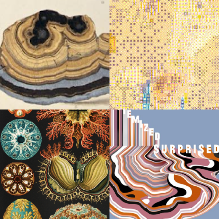
Visual inspiration for the theme “Down to earth,” drawing from the artwork of Ernst Haeckel and Keetra Dean Dixon, as well as sediment layers and grain texture.
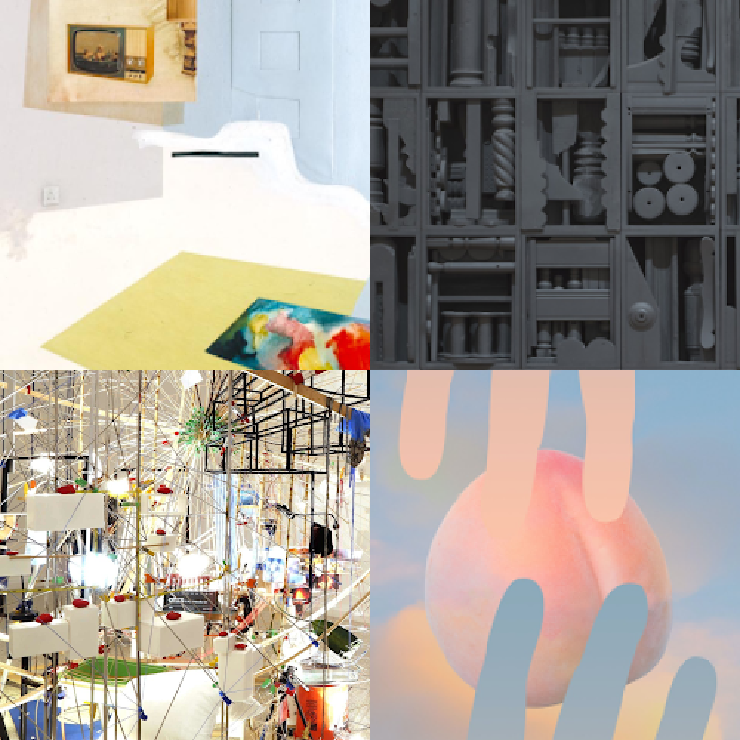
Visual inspiration for the theme “Collage & assemblage,” drawing from the artwork of Richard Hamilton, Louise Nevelson, Sarah Sze, Anthony Gerace, Kanghee Kim
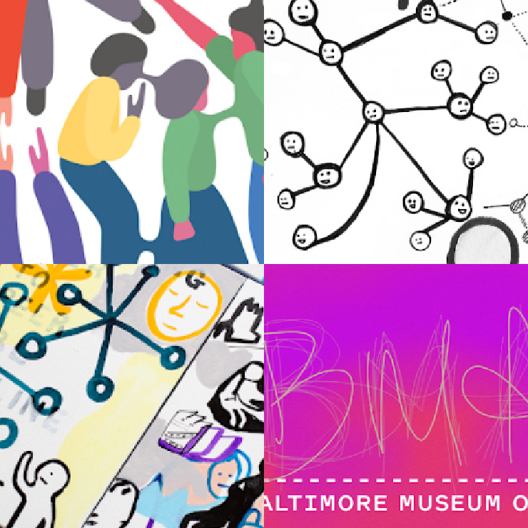
Visual inspiration for the theme “The human experience,” drawing from works by Geoff McFetridge, Taeyoon Choi, and the Baltimore Museum of Art.
Building our name: staying friendly and trustworthy, precise and expansive
Alongside our explorations into a visual identity that suited us, we undertook a related journey to rework our name. Simply Secure didn’t fit us any more for many reasons. It described our work in a very limited way, which made it hard for us to communicate the breadth of our offerings and expertise to our partners and our community.
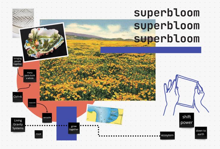
To say naming is difficult is an understatement! But things changed when Hanna found one image in the mood boarding process: a patchwork of riotous color on a mountainside. It was a superbloom - a mass blossoming event in the desert of the west coast of North America. Some of our Californian team members instantly recognized it and added the name “Superbloom” on our list of name ideas, and we just kept coming back to it. “We’re Superbloom,” we tried saying. “We work at Superbloom.” “This report was authored by Superbloom.” It felt optimistic, energetic, and easy to say – and it passed legal review. We had it!
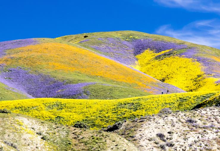
A superbloom at Carrizo Plain National Monument. Source: https://www.flickr.com/photos/blmcalifornia/33688792841
A superbloom is a rare desert botanical phenomenon in which an unusually high proportion of wildflowers whose seeds have lain dormant in desert soil germinate and blossom at roughly the same time.
We are Superbloom. Changing who technology serves.
While our new name gets the spotlight, our tagline gave us the confidence to choose it. The name doesn’t actually describe what we do; it evokes a feeling. The tagline, on the other hand, complements our name by giving a literal description of who we are.
Taglines have a lot of demands on them! We needed something clear, people-centered, authentic, and friendly, all while conveying our mission and giving us room to grow. We mixed and matched words, like a digital version of magnetic poetry, until we had a combination that scored high on all these criteria: Superbloom – changing who technology serves.
Developing the Superbloom design system
The Logo
Condensing complexity into a single recognizable graphic was a challenging and sophisticated graphic design task. We needed Hanna Kim’s expertise and inspiration - when she came up with the asterisk, we were excited from the start.
The asterisk is rich in symbolism:
- Privacy and hidden information: when typing a password, characters may be obscured with an asterisk.
- Depth and detail: when an asterisk appears at the end of a sentence, it leads to a footnote explaining more. In several programming languages, asterisks denote comments.
- Flourishing and blossoming: the asterisk resembles a flower, pointing to our name, Superbloom.
As multilayered as the asterisk is, though, it was missing one important aspect: our community-oriented, human-centered focus. Hanna built that into her rendering of the asterisk by making the logo creation into a participatory exercise.
We asked team members, committee members, and board members to contribute and co-design with us by submitting their hand drawn asterisks. The submissions were combined to form the organization’s logo, symbolizing the group effort and contribution. In this way, we have a logo born from the community.
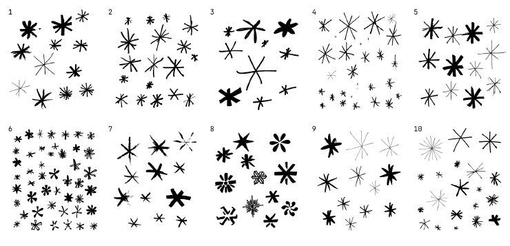
Our collection of hand drawn asterisks submitted by our community.
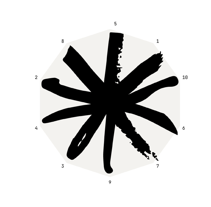
A collective 10-point asterisk was created by fusing together each member’s strokes like puzzle pieces, creating a composite 10-point asterisk made up of all of our handwriting.
Colors: Found in nature
Following the findings from our moodboarding exercises, our colors are found in nature. Though saturated, they are more muted than neon or web-based colors, friendlier for human eyes. They have grainy textures that look like pixels — though they’ll usually appear on a screen, they welcome human touch.
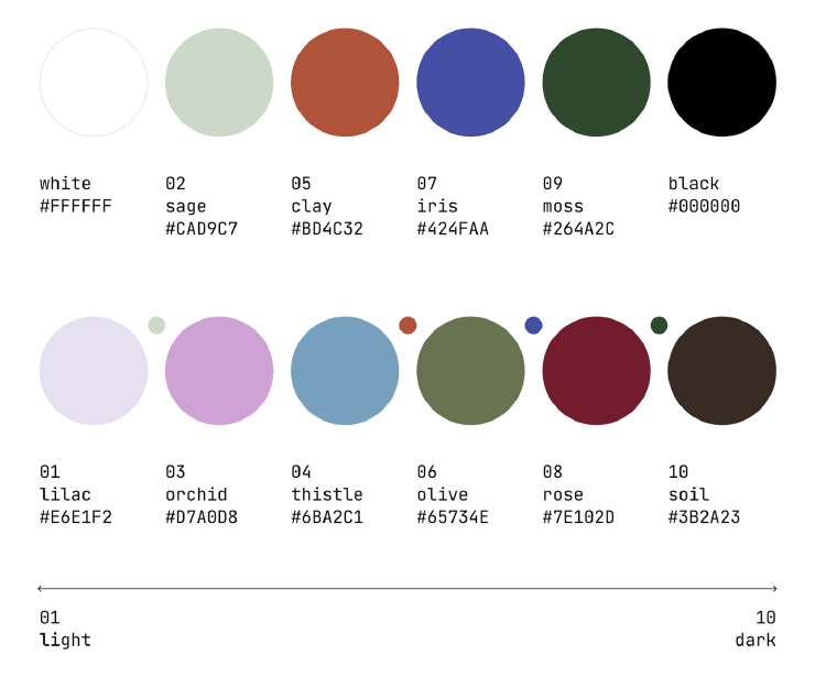
The Superbloom color palette
Typeface: JetBrains Mono
We chose JetBrains Mono in our logotype to add a techy-touch, balancing out the hand-drawn asterisk. JetBrains, a monospace font, is made for reading code. We liked that it is taller than some monospace fonts, improving accessibility and readability. To cap it off, JetBrains Mono is free & open source.
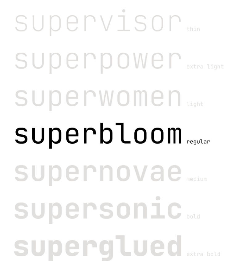
The Superbloom typeface is JetBrains Mono.
Graphics: Human hands doing things
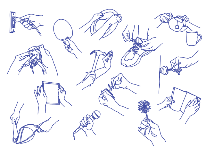
We’ve punctuated our name, tagline, logo, and typeface with a human touch: line drawings of hands doing things, penned by our very own team member Molly Wilson. To us, this style combined the best of who we are and what our visual exploration brought forward: we’re doers, focused on the human experience, with a “down to earth” energy. These hands represent the human experiences, ideas, and lives that sustain a safer and healthier digital world – they are personal and full of energy. They keep us grounded in the people that power and inspire Superbloom.
Lessons we learned
Make feedback central to the process
Most design project planning starts with deliverables: when will the logo be done? What about the color scheme? We took a different project management approach in order to incorporate insights from our team and community at every stage. By starting with the feedback loops we needed, other project pieces fell right into place.
Go slowly until it feels right
Even with a great list of heuristics and an afternoon set aside to discuss name or tagline ideas, we weren’t always able to land on “the one”, and even though this sometimes felt dispiriting, we were careful not to rush the process. If we felt stuck, moving to another area – the name, the tagline, or the visuals – often gave us a much-needed creative jolt.
Explain your instincts
Creating lists of criteria helped us take personal taste out of the equation. We all have a certain aesthetic and our own likes and dislikes, but we needed to set them aside; this identity is meant to be bigger than us and serve the organization well into the future.To facilitate this, we requested that feedback follow the framework: “I think X fits because Y”.
Always remember the foundation
Whenever we felt like we’d lost our way, we went back to the attributes we’d established in our community workshop.After all, our new brand is a communication tool, and those attributes are the story it needs to tell – using pictures and words, with letters, colors, and symbols. We think Superbloom’s new identity tells the story of us, and we hope you do, too.
Credits
Project Team: Georgia Bullen, Melissa Huerta, Molly Wilson, Kelsey Smith, Hanna Kim, Susan Kennedy, Katie Wilson, Philliph Drummond, ngọc triệu
Our new visual identity was developed in collaboration with a host of partners, using a community-based design approach. Thank you for contributing!
- Simply Secure team & alumni: Georgia Bullen, Cade Diehm, Ame Elliott, Eriol Fox, Melissa Huerta, Susan Kennedy, Rae McKelvey, Nicola Pratt, Piper Ru, Kelsey Smith, ngọc triệu, Eileen Wagner, Katie Wilson, Molly Wilson, Carissa Yao, Philliph Drummond, Aaron Brunmeier, Kami Joseph
- Our rebrand committee: Jochai Ben-Avie, Peter Bihr, Sage Cheng, Antonela Debiasi, Eriol Fox, Allen Gunn, Julia Kloiber, Niels ten Oever, Ttcat, Kirstie Whitaker
- Board of Directors, current and recent alumni: Ben Scott, Sara “Scout” Sinclair Brody, Dorothy Chou, Jackie Lu, Jasmine McNealy
- Visual designer: Hanna Kim
- Co-Design Advisor: Una Lee
- Writing consultant: John Stith
- Transformation Coach: Vanessa Rhinesmith
- Legal team
- Survey respondents