“Security doesn’t have to be confusing to people.” That’s been Simply Secure’s rallying cry since our founding in 2014. To make our vision of usable security a reality, we’ve contributed design to a variety of tools that enhance security, from Tails to I2P to NoScript. We’ve held salons and a residency around designing for security.
But we’ve done a lot of work that is better described more broadly as design for trustworthy technology. Just in the last year, we’ve launched a decentralization pattern library; a report on trust and transparency in nonprofit funding; a campaign to save internet freedom tech; a community around human rights centered design; a series of videos about trust and responsibility in design; a set of workshops on design for data donation; and much, much more.
Outgrowing our name
This is why we started to feel that the name Simply Secure was getting in our way. We explained again and again to potential collaborators, to funders, and to our community that we work on more than just security-focused tech (and also that we don’t think security is simple!). We clarified over and over that we have nothing to do with a certain IoT home security company. We realized that we needed a name that helped us share and communicate our vision. Personally explaining our name to everyone just isn’t a great use of our time.
We held internal retreats to clarify our mission and vision. We had fun brainstorming wacky name ideas. But just coming up with a new brand by ourselves, or with the help of an outside firm, felt risky.
Because we’re not actually the “end users” of our name, our logo, or our color palette. We’re not the most important stakeholders. We’re not the people whose opinion most matters. You are.
If we rename ourselves and you, reading this, don’t get what we did and why, if you don’t groove on it… well, then we can’t really serve our community effectively, and we’ve done something wrong.
That’s why we reached out to Una Lee of And Also Too. Una and her team are experts in co-design: the process of designing and deciding together with a community, rather than behind closed doors. We were delighted when Una agreed to mentor us through our own co-design process. In September 2020, we officially launched the search for Simply Secure’s new name, and we committed ourselves to sharing our process publicly as we go. So hold on tight, and welcome aboard!
We asked you – here’s what you said
Our first step was to send out a 5-minute survey asking what our community thought of Simply Secure’s current name and visual style. The survey was open for 3 weeks and received 54 responses. Here’s what we found out.
Our name
For a large majority of respondents, our name doesn’t capture what we do. They say that “Simply Secure” sounds like we only do security, and we do a lot more. Our name doesn’t imply anything about design or UX, anything about education, anything about human rights, or anything about being a nonprofit. It’d be impossible to think of a name that communicates all these things! But we also don’t want a name that only has to do with part of our work.
This could be anything about security or safety. How would anyone know it’s about design/UX?
It’s not holistic or broad enough. The people I’ve worked with bring elegance and clarity to projects.
No, because you work on many more issues than just security, and it doesn’t speak to the community-oriented dynamic that you cultivate as an org
Not everyone dislikes our name. However, when describing what we do, those respondents say, “you make security technology easier to use.” So it makes sense to us that these folks think our name is a good fit for us – for the security usability portion of our work, “Simply Secure” actually is a pretty good description.
Good name - it’s about making security simple.
[I don’t like the name for you] because I think your work has broadened beyond a focus on security. But I do think it is a good name.
Five respondents mentioned the similarity to SimpliSafe, a US-based IoT home security company. Given that SimpliSafe’s privacy policy gives the company license to store and analyze recordings of your home, we’re not particularly happy about this association.
Our logo
One big surprise for us: five respondents said that they like the sticky notes on the logo. The funny thing is, sticky notes actually weren’t at all what we had in mind. The proportions of the squares in the logo are supposed to represent the Fibonacci sequence, which is a key part of many cryptography algorithms. But now that we see the “sticky notes” in the logo, we kind of love it.

Five more respondents said the logo reminds them of various corporate apps; Slack came up a few times, as did Google. Given the type of work we do, these aren’t exactly the mental connections we want folks to have when they think of us.
Our visual style
Respondents generally appreciated that our look is not dark, scary, or self-important. But we heard a lot of adjectives like “childish,” “kindergarten-ish,” and “playful.” Many people told us that our imagery was too fun and light for the heavy, intense, and even dangerous topics we deal with.

It’s not very memorable. I get children’s birthday party from it.
Too happy and bright - your work is about serious and concerning topics.
The message we heard was: it’s refreshing that we present ourselves as welcoming and humble! But we also need to show that we take our work seriously. Imagery like balloons and cookies, and an aesthetic based on big, flat, brightly colored shapes, don’t communicate that we are a trustworthy, experienced partner for sensitive design and facilitation work.

I worry that the rabbit ears in the hat makes a gesture toward being bewildering, rather than simple.
Out of 54 respondents, not a single person said that they liked our visual style in general, or that they thought it was a good representation of us. This confirms our hunch that we really need to rethink our look and feel.
What we do
We sought out survey responses from people who already knew at least a little bit about us, either as individuals or as an organization. Respondents were very consistent in how they described our values and attitudes: putting people first, breaking down boundaries around how tech gets created, and paying attention to the “edges” often neglected by mainstream tech.
Their answers to “what does Simply Secure do?” were more varied, and depended on the work they’d done with us. Here are the most prominent types of answers we got.
- Some folks painted us as conveners, networkers, and facilitators, bringing together people in the nonprofit tech space and creating connections between people and organizations. These people had often attended one of our workshops, or were part of our Slack.
Great listeners and communicators.
A convener, a facilitator, a co-designer with a diverse outlook and commitment to security.
Convening design thought, resources, and processes.
- Some people saw us as experts in usable security. These people tended to have been aware of us for a longer time. This makes a lot of sense, because a few years ago, a larger percentage of our work was in fact directly related to security usability.
They help tech projects think carefully about how to design projects with security and usability in mind.
Human-centered approach to design, security, and internet freedom.
- Several people mentioned that we promote and share resources about thoughtful, responsible human-centered UX practices – not necessarily just about security. These tended to be people who found out about us more recently.
Digital agency with values for the future: transparency, security, ethics, environment.
Design research and training agency focused on human rights centered design.
- People who were in a managerial role tended to mention our work using design research to support other nonprofits.
Use data and storytelling to support organizational growth.
Research design, helping people think about communities.
Honest brokers for organizational planning and design.
One of the most common responses was the feeling that people are seeing the tip of the iceberg. There’s a feeling that we do “more,” but it’s not always clear what.
Design + so much more!!
I know about some of the work around design, but honestly I am not sure what the day-to-day of Simply Secure looks like.
You do great projects but don’t get a lot of opportunity to talk about them.
The intangible attributes that respondents mentioned were lovely to read, and a nice pick-me-up in tough times. Please remember to actually verbalize your compliments to the people you admire – it means a lot. We all need the boost right now.
Trustworthy and practical.
Super inspired by your work!
I gotta lotta love for Simply Secure.
Who responded?
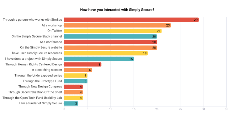
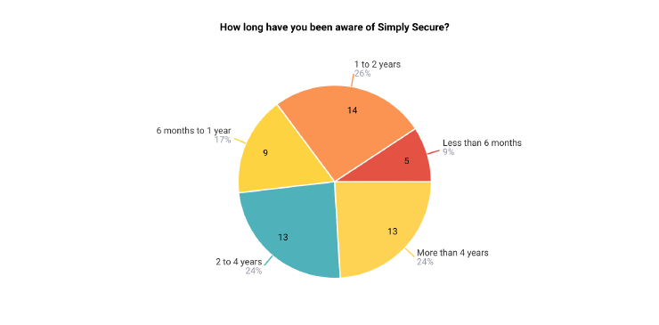
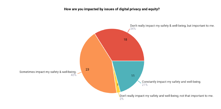
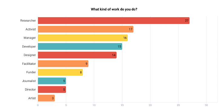
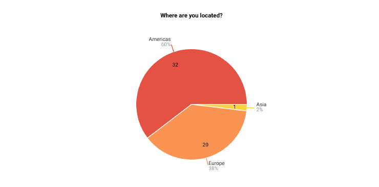
54 people responded to the survey. Here are some charts showing the demographic breakdown.
For the multiple-response questions, we didn’t include responses checked by only 1 respondent, in order to keep the chart size manageable. We occasionally omitted custom responses from the charts in order to protect respondents’ privacy.
Conclusions
We can’t draw conclusions about our community from this survey, since we used a convenience sample, drawn from Slack, Twitter, and some mailing lists. However, among the people who filled out the survey, we can draw some conclusions about ourselves:
- We need a new name. The name Simply Secure is misleading. It only refers to part of our work, and it has some unfortunate associations.
- We need a new color palette. Our logo, color palette, and visual style are inappropriately playful. However, we shouldn’t swing too far in the other direction and go super serious.
- People who have known us longer are more likely to think our current branding is okay; people newer to us are more likely to be confused by it. Thus, changing our branding makes sense if we want our community to grow.
- We need to do a better job communicating the full range of what we do. UX design, community work, and work with nonprofits and open source are all important parts of our identity that don’t come through clearly with our current branding.
- People (at least, the people who took the time to answer the survey) appreciate and understand our work! Yay.
Next steps
We’re going to undertake this process together with an advisory committee, made up of people who are part of our community. Through a series of workshops, they’ll help us generate ideas, narrow down our options, and recommend a new name and visual style. We’ll announce the advisory committee on this blog shortly.
Any questions? Any thoughts? Drop a line anytime to Molly Wilson and Kelsey Smith at [email protected]. We’re looking forward to going on this journey with you!