About the project
The Invisible Internet Project (I2P) is a network layer that allows for censorship-resistant, peer-to-peer communication. Anonymous connections are achieved by encrypting the user’s traffic and sending it through a volunteer-run network of roughly 55,000 computers distributed around the world. It is similar to the Tor network, but focuses more on accessing hidden services than the Clearnet.
 “itoopie”, I2P’s mascot.
This project, a collaboration between Simply Secure and Ura Design, provided usability feedback and strategic proposals for I2P. The goal was to make I2P a more usable tool for novice users, thereby adding to network traffic and anonymity guarantees for all users. While Simply Secure focused on a heuristics review and a workshop on information architecture, Ura Design will take on I2P’s brand identity as well as the console redesign. ̨̨̨̨̨
Design problems we addressed
Documentation UX and website IA
I2P’s biggest challenge in onboarding new users is explaining its complex technology in an accessible yet accurate fashion. The website provides a lot of information, but both the content and the navigation confuses new users.
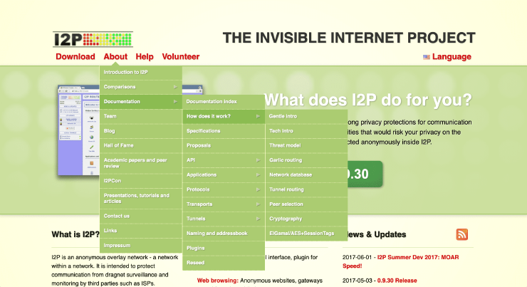
2017 version of I2P’s IA, which has since seen many updates.
The reasons for this are all-too-familiar: I2P’s long history as a volunteer-run open source project, the many different user groups it serves, and the inherent complexity of the technology itself all contribute to a large body of information on the website. Among the core audiences, we have new users, returning users, network operators, contributing developers, academic researchers, and the press. Contributing developers sub-divide into: core protocol developers, application developers, and router developers. Needless to say, that is a lot of technical information that needs to be documented and communicated, and the lack of a separate documentation only exacerbates the architecture here.
Terminology
Is a toot different from a tweet? Mastodon, a decentralised alternative to Twitter, is helping and not helping by using alternative terminology. Yes, a toot is different from a tweet—a toot is often only shared with people in your Mastodon community, whereas a tweet is always public; and no, tooting is just the cool kid’s word for tweeting, the core idea is the same.
I2P has a similar issue with its relationship to the Tor project. Both are network layers operating on top of the internet, both aim to preserve user’s privacy and anonymity, both are community-run open source projects, and have an academic following. However, the Tor project much more known and used, and having diverging terminology for these two projects is confusing to most users, who will be more familiar with Tor.
What is “I2P”?
Related to terminology, there is a deeper question of what the term “I2P” stands for. Is it an animal, a vegetable, or a mineral? Users need to create a working mental model of the technology to use it confidently. Right now I2P stands for both a network, a protocol, a community, a collection of websites (“eepsites”) and is associated with tools like the “I2P router”, “I2P console”, and “I2P browser”. How do things fit together in this universe? What are the nouns and the verbs that people absolutely need to understand to operate in this universe?
When users encounter new technology, they are asking four kinds of questions:
- What is it? - Is it a community, an application, a database, a protocol, a platform, a service? Who’s behind it? Do I pay for it?
- How does it work? - What kind of technology is at work here? Does it use machine learning? Does it work offline? Does it collect data from me?
- How do I use it? - How do I connect? Do I need a smart phone? Do I need an account?
- Why should I use it? - What features does it provide? Does it meet my needs? Does it align with my values?
It’s important that these questions are answered — not necessarily in this order, and not necessarily at the same level of detail, but ideally in separate, navigable sections on the homepage or “about” page. This could also come in form of a high-level guide to the ecosystem (a diagram, a glossary, an example workflow), as well as clear explanations that use metaphors and illustrations to support building new mental models.
Activities
We worked with the I2P team in March/April 2020 on two items:
- heuristics review [PDF] with two designers testing I2P on their devices and systematically reviewing usability
- 2 three-hour-long IA workshops with two I2P team members and two designers working through a new information architecture
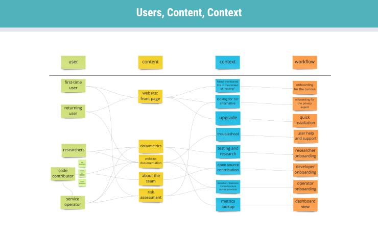 Understanding different use cases of the same content.
Results
New Information Architecture
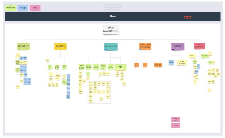
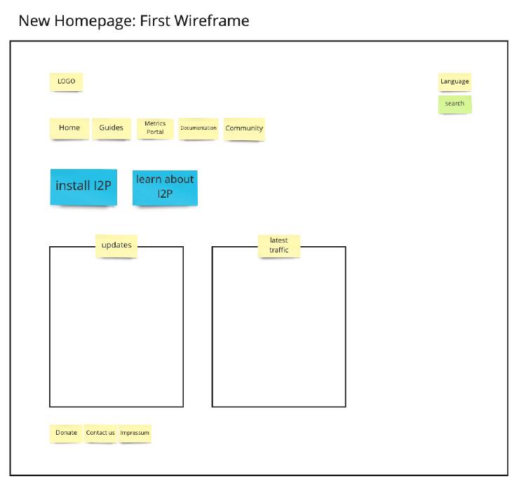
I2P is a complex project with many moving pieces—and that won’t change anytime soon. To help users navigate the website, we want to distinguish three larger contexts going forward: learning (for learning about the project), guides (for installation and network operation), and documentation (for code contributions). Furthermore, we applied a generic navigation for standardized way-finding. The result is a sitemap that is deep rather than shallow: fewer items are surfaced at first to not overwhelm users.
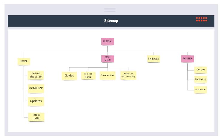
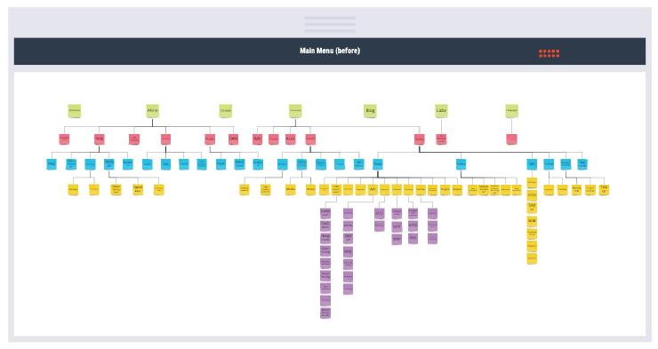
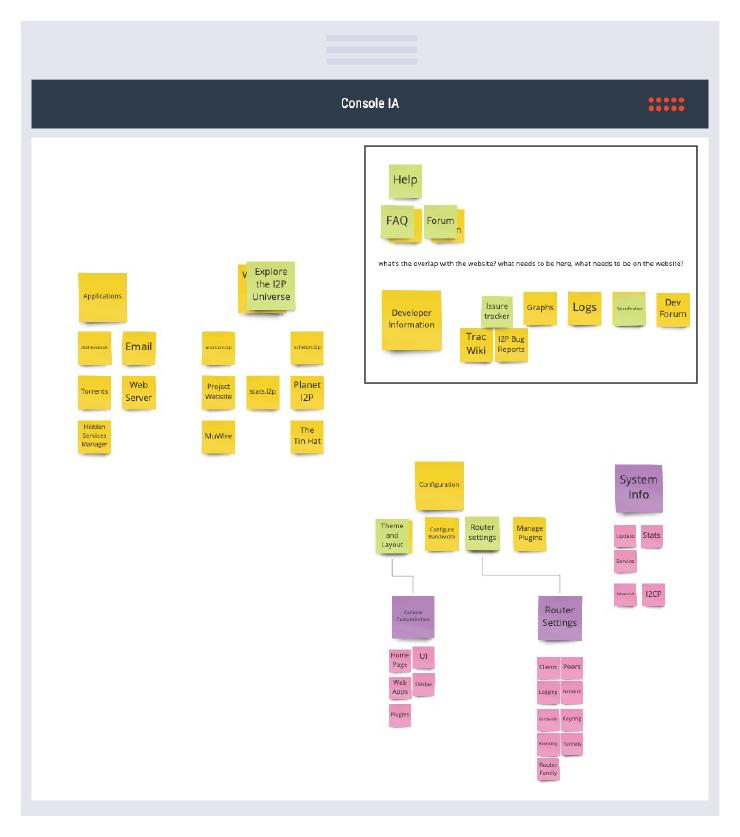
The console’s architecture also received an update. Most of the changes revolve around grouping settings and configurations in a way that reduce the information presented at the same time (resulting in “deeper” trees again). One design question concerns “help and support” within the I2P console vs on the website (not always accessible once you are connecting over I2P). Should both sites have the same content for familiarity? Or should they differ because not every FAQ item is equally relevant? For instance, you wouldn’t lookup how to install I2P if you made it onto the I2P console. This is open to testing, but for now we opted for a “help and support” that is more relevant for the current context.
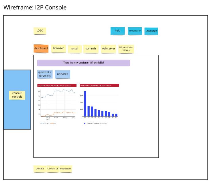
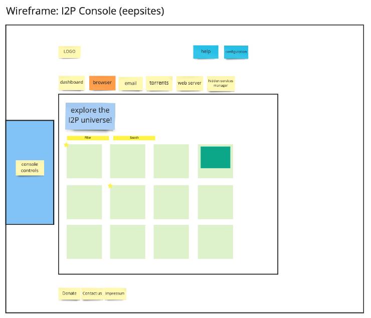
To support implementation, we also sketched first wireframes, both for the website and the console. The console’s main function is to control the connection over I2P; that will remain on the left as a side bar. The rest of the console is now a center stage with tabs—all familiar UI patterns. That allows the user to navigate different, additional functions of the console: a dashboard, a “browser” to explore other eepsites, an email client, and other applications. Configuration and support remain on the top right for constant reference.
Controlled Vocabulary
From now on, I2P will adopt more consistent language around its many tools. We have started working on a controlled vocabulary:
- I2P: a protocol for a network layer
- Eepsite -> I2P site: a website only accessible over the I2P
- I2P network: the active number of peers connected over I2P
- I2P launcher: an application that allows you to open an I2P-ready browser
- I2P console: an in-browser application that controls how you connect over I2P
- I2P browser: a browser that connects over I2P automatically (inactive project)
- Router -> I2P router: a translator for IP to I2P
- Peer/ Node -> Peer
- User -> Participant
- SusiMail -> I2P Mail
- SusiDNS -> I2P DNS Server
- Hidden Services -> I2P Network
- Hidden Services Manager -> I2P Network Manager
- I2P services -> I2P apps/applications
- Bote/I2PBote/i2p-Bote -> I2P bote
- itoopie: I2P’s mascot
- Clearnet -> the Internet
Browser extension direction
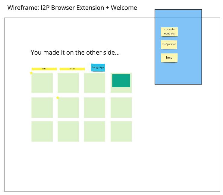
In the course of our design, questions around mental models kept resurfacing. Current users are expected to download a package installing the I2P launcher which in turn opens a browser console which in turn allows you to connect over I2P… Anything reducing the number of steps required to get started would go toward wider adoption. The choice of UI depends on the scope of the console. If the I2P console should change all network connections over to I2P, then new users should install a general console application (similar to, for example, Mullvad’s VPN menu control). If the I2P console should only change the protocol for a specific browser, then new users should only have to install a browser extension. That way, users only have to make changes within one context to use the I2P network.
Process recommendations
Going forward, the I2P team will do well adopting the following design practices.
- Journey mapping. What are the steps required to download and install I2P? Where are the pain points, and what could a guide/wizard do to prevent errors?
- User testing. New ideas—be it words, UI, or entirely new products (such as a browser extension) would benefit from early testing. This needn’t be more than a few simple mockups. Make sure to test with your target users (not just the power users who are more easily available for testing).
Lessons
This project began as an information architecture project: in sorting through how information is classified and presented, and in analyzing different users and contexts, we arrived at a cleaner and more focused version of the website’s and console’s information architecture. But looking at IA is also looking at how things fundamentally fit together, and that surfaced underlying questions around strategy. What tools and processes make most sense together? Which users and use cases do we want to prioritize? Answering these questions ultimately made decisions about terminology, content, and architecture easier.
Another insight was that the typical user question around “how does it work” isn’t just about the underlying technology, but also about how one should use it. A protocol can be realized in many ways; the decisions of the I2P community to use a launcher, a browser, and a console is just one way of using the I2P protocol. While users need to learn about the features of I2P, it is equally important to explain how these different tools and processes work together. To that end, diagrams or videos could help illustrate these concepts.
Finally, a tactical design recommendation: when technology is new, rely on familiar patterns as much as possible. New users will be struggling with concepts around routers, peers, and I2P sites. Designers should give users a handrail to grab onto, even if it’s just calling the Internet “the Internet” (rather than “the Clearnet” from the vantage point of I2P).
This project was funded through OTF’s Usability Lab.