There’s a misconception that highly technical skills like cryptography are required to work in security. That’s not true. With critical threats to internet freedom and individual privacy, there is an urgent need for designers to get involved with security projects.
UX designers are an important part of reframing the conversation about security. Instead of assuming that security’s UX needs to start with ways to discourage undesirable behavior, we should start from a positive mindset of elucidating its benefits to users. Here are three ways that non-technical UX skills can improve security.
Privacy as part of a brand promise
Copywriters and brand strategists have a role to play in protecting privacy, so think of their skills as part of the UX toolbox. Canadian VPN TunnelBear uses gentle humor and illustrations to convey the benefits of security to customers. Instead of the militaristic language of defensive cyber-security, TunnelBear communicates a warm but firm commitment to privacy.
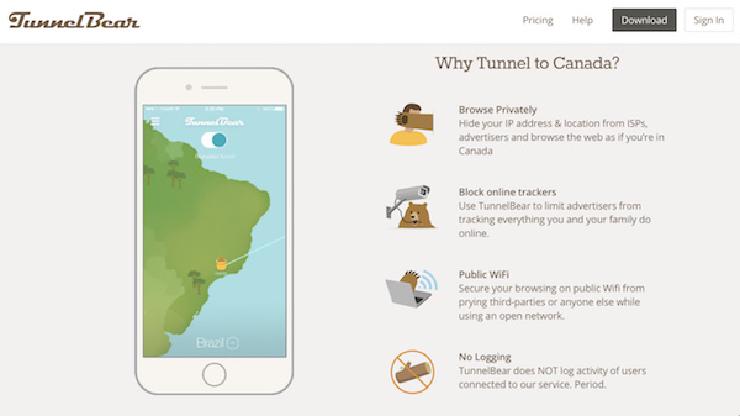 Description from the TunnelBear.com website
Other places where skilled writing can communicate how your service protects privacy include the product description in app stores and during new feature updates.
Service design for two-factor authentication
Composing messages and notifications is hard, but instead of being generic and detached, copywriters can cultivate a more personable presence.
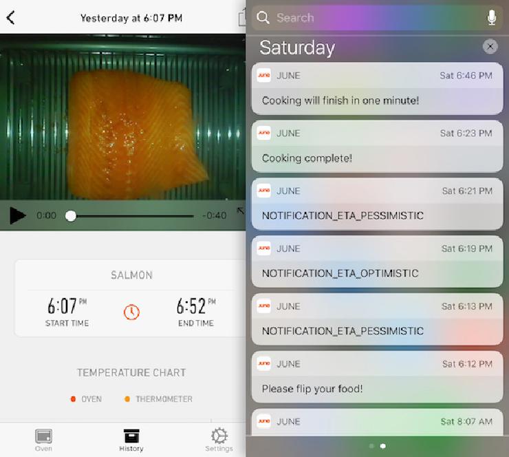 Image from Mark Wilson’s review of the June oven in Fast Company
These notifications from an IoT oven (which have since been rewritten) show just how difficult it is to write copy for an alert
Coming at security from a service-design lens would improve the UX of two-factor authentication (2FA), which adds an extra layer of protection beyond a password. For example, Google accounts with 2FA enabled will send a code to users’ phones. But these messages are a missed opportunity to build a relationship with users who are taking positive steps to protect their privacy.
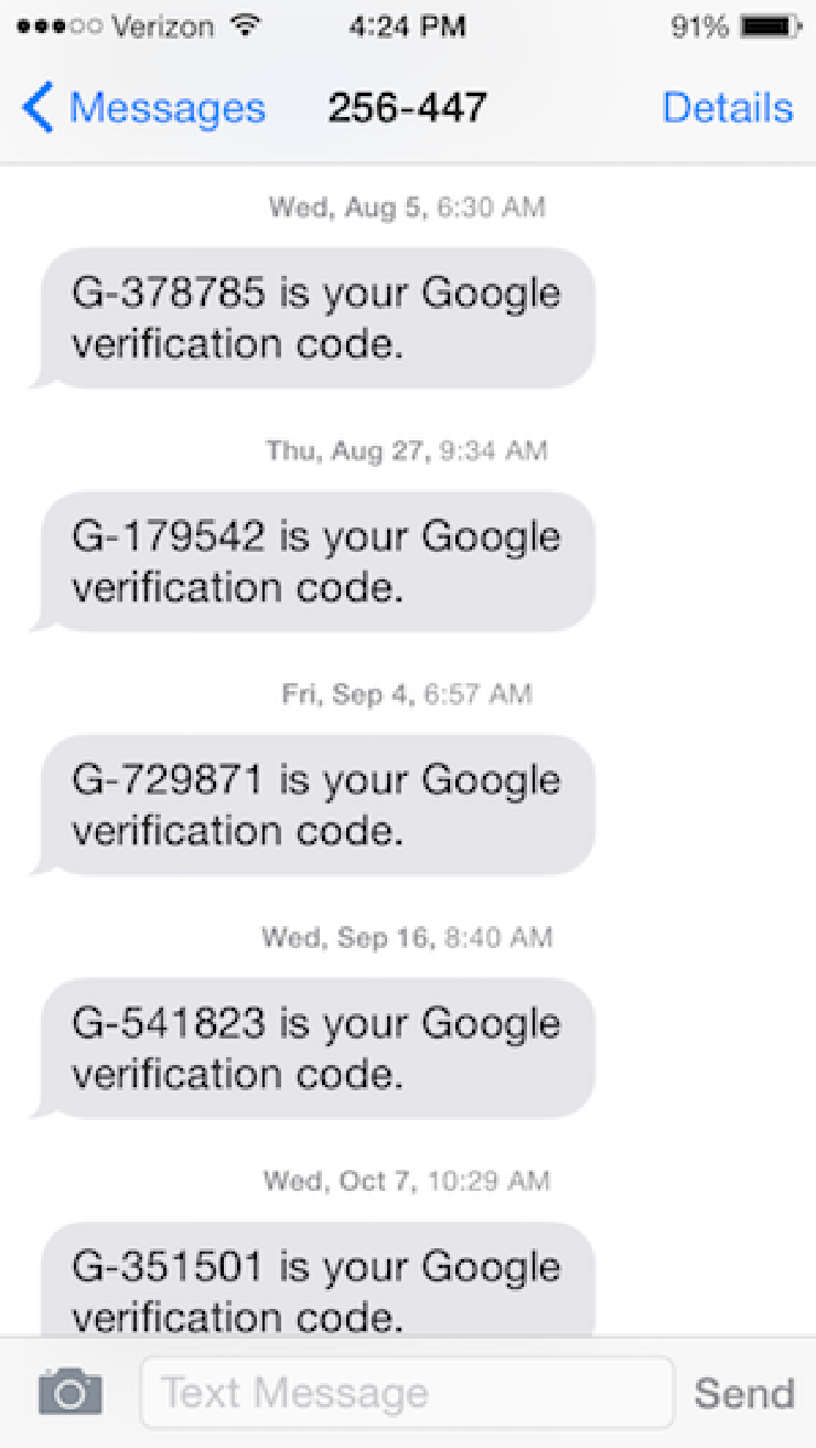
Interrupting people’s workflow when they are trying to access their accounts isn’t ideal, but 2FA messages are an overlooked touch point. Considering the rise of SMS chatbots, these messages could be opportunities to applaud people for secure behavior or to act as a concierge for security practices. For example, it might answer questions such as “How do I make sure my router has the latest security patches?” or “Are other people getting a warning when they try to login to the Bank of America website?”
Interaction design to communicate system behavior
Visual design and animation are powerful mechanisms for communicating how systems work. Giving users insight into messaging systems could increase demand for privacy-preserving systems. For example, messaging systems such as Facebook use an animated graphic to let users know that someone is typing a comment, thereby making an invisible action visible. What kinds of new graphics could convey that a message has been encrypted? Or delivered? Or expose where the data are stored?
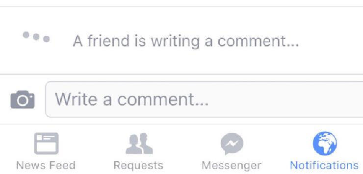 Facebook use an animated graphic to indicate when someone else is typing a comment
Many apps, including WhatsApp and iOS iMessage, use read receipts to reveal that someone has seen a message. These simple visual vocabularies are powerful in communicating how the system works. iMessage displays the words “read” and “delivered” to indicate status while WhatsApp uses check marks to indicate if the message has been seen.
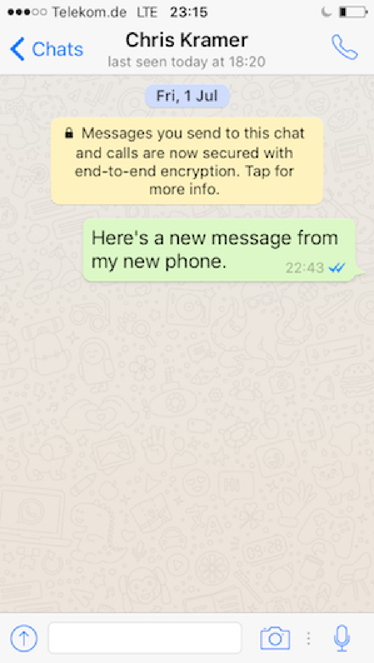
Read receipts demonstrate how UX can change and normalize new behaviors. In the past, users who didn’t have time to respond to text messages could still read them. Now, users who don’t know that they can disable read receipts may avoid opening WhatsApp until they have the time to respond. This way, they can maintain plausible deniability for a slow response time. Designers can help users develop behaviors that protect their security and privacy in a similar fashion.
For example, the Google Chrome team takes UX seriously and has done research on how the visual design of browser warnings impacts user behavior. The browser currently displays a neutral “information” icon for sites that don’t support encryption, or that have problems with their encryption. The team has announced that this will change to a scarier, more prominent warning icon next month; they are using this as an opportunity to engage users in understanding risks to their security.
 Chrome currently warns users that they are visiting an insecure site with an information icon
Security and positive design
Security teams often have a reputation for saying “no” because they think that the best way to protect users is to limit their behavior. But a good UX can also impress the benefits of security upon users through an affirmative approach. Non-technical UX skills such as brand strategy, copywriting, and visual design all have pivotal roles to play in helping people protect their privacy.