Last week Google unveiled a new logo as part of an updated brand identity. Professional typographic designers were swift to react. Tobias Frere-Jones, designer of Interstate and other widely-used fonts, said “I really hope this ’e’ does not become a thing.”
Beyond professional designers, the New Yorker’s Sarah Larson complained Google “took something we trusted and filed off its dignity.” The Google logo reaches the level of cultural commentary in a general interest magazine because its use is so widespread.
Logos in the Landscape
As a point of historical comparison, in 1970 designer Saul Bass created a new bell logo for telecommunications company AT&T. When AT&T updated to Bass’ bell logo they changed:
- 135,000 Bell System vehicles
- 22,000 buildings
- 1,250,000 phone booths
- 170,000,000 telephone directories
Those numbers, taken from the description of the imaginative 1969 pitch video, capture what was the largest corporate re-branding effort of the time. Although a meandering twenty-six minutes full of dated cinematography, the video makes some still-relevant points about why companies change logos. Starting at 6:09 the narrator describes how logo changes signal to external audiences (customers) and internal audiences (employees) that the organization is a different kind of company with different values.
Interpretations of what the new Google logo means range from enthusiasts seeing evidence of a company maturing and becoming more interested in design, to critics observing that the friendly, approachable letters could be a counter-measure against the company’s Orwellian growth.
Logos and Nostalgia
A negative reaction to the new Google logo is understandable, because any change reminds users that those browser tabs and mobile app icons can be modified at will. When Larson demands Google “give us back our serifs,” we’re reminded that those serifs weren’t ours to begin with, but were simply part of the landscape we passed through. Similarly, the Southern Bell pay phones emblazoned with Bass’ logo were part of the landscape of my childhood, but they weren’t mine to control.

Southern Bell logo (1970-1983) designed by Saul Bass.
Strong emotional bonds fuel nostalgia for lost logos. Given the place that NASA (the United States’ National Aeronautics and Space Administration) holds in the hearts of many Americans, it’s not surprising that the organization’s retired logo – which was part of a set of graphics standards created by design firm Danne & Blackburn – is still revered. A recent crowd-funded campaign to republish the 1975 NASA Graphics Standards Manual as a hardcover book ballooned past its goal the day it launched, even though those standards are available free as a PDF.
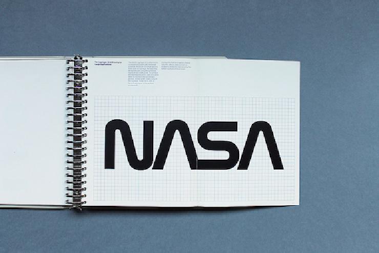
Page from the 1975 NASA Graphics Standards Manual.
Danne & Blackburn’s logo is more than the beneficiary of nostalgia. It’s a powerful, simple design classic of extraordinary flexibility. Their logo is successful in sizes ranging from icon on a business card to the exterior of the Hubble Telescope, where it continues to orbit the Earth today.
Brand Guidelines for Correct and Incorrect Use of Logos
The NASA Graphics Standards Manual is one example of brand guidelines. Unlike logos, where everyone is entitled to an opinion on whether they like or dislike the styling, brand guidelines go beyond style preferences to create an independent system by which design choices can be judged to be right (“on brand”) or wrong (“off brand”)." You may think that a particular logo is badly done or not to your taste, but still be able to conclude that it is used correctly if it follows the brand guidelines.
Mozilla’s brand guidelines are unusual because they allow use of any solid color. New York University’s visual identity (PDF) is more typical in describing exact colors, sizes, positions, and how to use the logo correctly. The American Red Cross’ brand standards include downloadable logos, which are important for reassuring participants of a high-quality experience when a community center hosts an official blood drive.
Why Secure Communication Needs Brand Guidelines
Brand guidelines ensure consistency when many different people are working on a product. This is an important component for building trust with end-users. It’s crucial for secure communication projects in particular because lay users can’t assess the underlying cryptography. Instead, they assess how trustworthy something is by the user experience, and consistent brand expression is a key part of that. As a counterexample, consider how a sloppily-implemented logo in an email can alert people to a phishing scam by signaling untrustworthiness.
Logos and brand guidelines communicate trust, and giving mass users confidence that open-source secure communications tools are trustworthy is an important step to driving adoption.
Image of Southern Bell logo, used under fair use guidelines
Image of NASA Graphics Standards Manual by Display Graphic Design Collection, used under CC-BY-NC-ND 2.0