Great user experiences are born through the hard work of professionals with a variety of skills. As illustrated by the UX unicorn we’ve seen before, there’s a lot that goes into what we call “design” or “usability.”
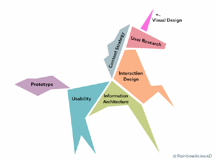
The skills and responsibilities of an effective UX team. Originally published in Building an enterprise UX team by Rachel Daniel (also on LinkedIn), UX Director at MaxPoint. Used by permission.
Looking at this unicorn illustration, it may be tempting to dismiss visual design as a “nice to have” skill. After all, it’s possible to make a basically functional piece of software without paying any particular attention to the visual design (just as a horse can get by without a horn). And unlike interaction design, which is possible to evaluate empirically through user studies, it can be hard to pin down exactly what makes a visual design “good.” This subjectivity can be compounded by visual design’s tendency to evolve and trend over time.
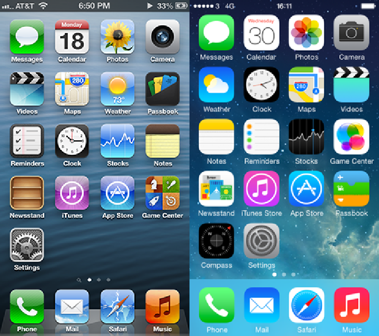
Observe the difference in the visual design in the icons of iOS6 (left) and iOS 7 (right). This change would appear to be driven largely by a desire to have the apps look fresh, new, and modern.
But visual design is about more than just making something pretty or trendy. Visual design includes typography, iconography, and color, all of which can contribute or detract from usability. These basic elements of visual design usually follow well-understood rules.
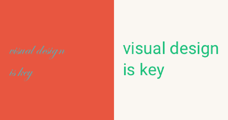
Typography and color selection can make or break a user’s experience.
Let’s focus for now on some basic ideas around color. A consistent and tasteful palette can be a great way to make your software, website, newsletter, and print materials more usable and attractive to your users. Simply Secure worked with a professional visual designer to come up with our colors (as documented in a post about our style guide), but it’s possible for even people new to design to select a set of tasteful hues. Here are some tips to get you started.
Read up on the basics
Are you confused by terms like hue, saturation, and brightness, and what bearing they have on making a color scheme attractive? Ria Carmin’s developer-targeted post addresses exactly that. (See “Rule 3: Color”.) She does a great job of breaking down different types of color palettes, such as those that follow a monochromatic, analogous, complementary, or triad scheme.
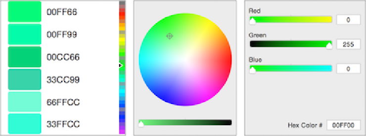
Traditional color pickers can be limiting, imprecise, or hard for color novices to understand.
Choose your tool carefully
When making a color palette, don’t work with individual colors in isolation. Many traditional color pickers in graphics software can be limiting, imprecise, or hard to understand. Free online tools such as Adobe Color, Paletton, and Coolors can help you identify a collection of colors that work well together. To play it safe, use the default settings and carefully modify one color at a time to watch the rest of the palette adjust.
Don’t go to the extreme
While it’s tempting to try and send a strong message about your software by using lots of intense colors, remember that moderation can go a long way toward making your project look professional and credible. Developers in the security community seem particularly drawn toward dark shades, which can feel unapproachable to some users. Another tendency is to pick the brightest, most saturated colors available, which can also be off-putting. Finally, remember that color is often used best as a highlight, not as the main body. Whites and greys with a small, coherent selection of accent colors allow the user’s eyes to quickly identify what belongs in the background and what needs their attention. For example, Simply Secure uses lots of bright colors on our webpage, but the main body of each page is a neutral white or off-white.
Has your team been struggling with color? Did you recently go through a redesign that you’re proud of? We’d like to hear from you; please get in touch!