Software communicates its values via its user experience (UX) by making some actions easy and others harder. For example, mobile apps can be configured to automatically opt users in to location sharing, and require people to dig through multiple layers of menus to opt out. This design choice reflects the developer’s belief that it’s ok to collect location data about users without asking their permission. But this is just one example; values are encoded in software in many ways beyond default settings.
In 2016 Twitter has come under fire for UX changes, most notably switching their classic star icon (meaning “favorite”) to the heart icon (meaning “like”). Other changes in Twitter’s UX send strong messages about what Twitter believes their platform is for.
The GIFs are coming! Get ready to search and send GIFs in Tweets and Direct Messages: https://t.co/uk75stt1zN pic.twitter.com/1dDD1B4CW2
The addition of GIFs to the compose window tells users that animated images are an expected, normal part of Twitter. This may come as surprise to long-time Twitter users who see it primarily as a professional or news-sharing communication platform. (These may be many of the same people who felt that hearts were inappropriate or unprofessional replacements to stars.) Normalizing the use of GIFs is probably a way to encourage new users or to encourage new behaviors by current users.
However, the implementation choices in the GIF search feature also send a more subtle message about how users are expected to express themselves.
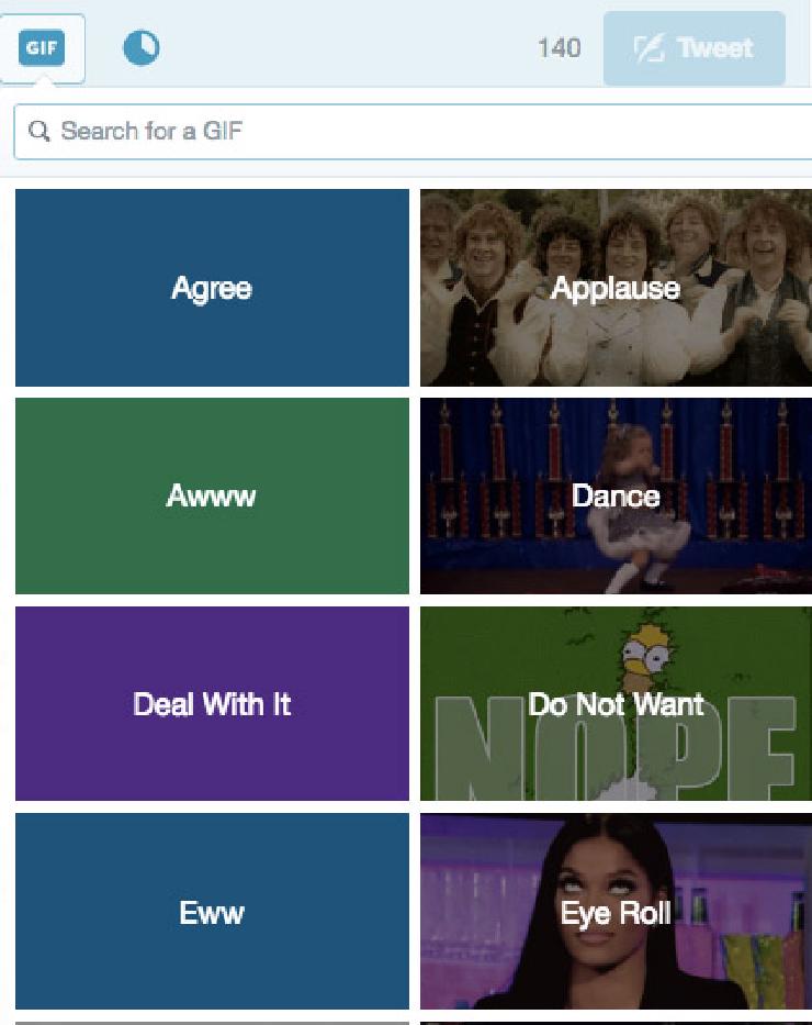
 Inserting a GIF into a tweet with Twitter’s web interface. Screenshot from the Twitter interface as viewed in Chrome on OSX.
UX Shapes Behavior
Looking at the options presented, we see that they have included only emotions in the top choices. This shapes user behavior by encouraging them to express strong agreement or dissent. The message that “Twitter is for arguing on the internet” is encoded into the UX. Of the 8 choices showing, four are positive (Agree, Applause, Awww, and Dance) and four are negative (Deal With It, Do Not Want, Ewww, and Eye Roll). The latter options tell users that they should expect to not only see things they do not want to on the platform, but to also share things that others don’t want to see. If someone questions your tweet, the UX suggests adding a “Deal With It” GIF as a response and moving on.
Twitter partnered with Giphy and Riffsy to provide the GIFs, which focus on pop culture in the United States. It’s not clear if or how either the selections of illustrated emotions or the default GIFS are localized for a global audience. The first image illustrating applause is a take from The Lord of the Rings fantasy movie showing white actors dressed in costumes similar to 19th-century British clothes. I have watched that movie many times, but it strikes me as an odd choice to illustrate “applause.” What does it feel like to not know who those people are? How does that impact diverse users’ comfort sharing that GIF? Any GIF? Using Twitter in general?
More fundamentally, what messages do the choice of images and titles for the GIFs send? How do they set the tone for conversation on Twitter? How do they welcome or exclude participation by different groups?
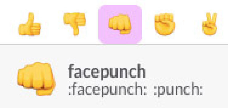
Communicating with graphics presents challenges for cross-cultural miscommunication in apps beyond Twitter. One example is the choice of words to describe emoji in Slack. I was surprised that the fist icon, which I had used for years on my iPhone in text and WhatsApp messages, is labeled “facepunch” in Slack. I thought of it as fist-bump, or a modern high five. So every time I thought I was sending a supportive “right on, you go, well done” message, the recipient may have thought I was punching them in the face.
 Facepunch sounds less supportive than fist-bump.
Designing for Inclusion, From the Beginning
I live and work in San Francisco and am familiar with many of same the Gen-X cultural memes that the people working at Twitter, Facebook, or Google are steeped in. I want to make tools approachable and accessible to a global audience, but struggle with ways to make my own biases and cultural assumptions visible so they can be questioned.
UX designers have an opportunity to design for inclusion from the beginning and to challenge their teams to make software welcoming to all kinds of people. Even just thinking about the hands that you show in your product can be informative. Facebook’s repository of diverse hand images is just one visual ways to remind your team and the world who you’re designing for (though I’d still like to see some painted nails, jewelry, and tattoos in the bunch).
Rizwan Javid created a set of multicultural names for InVision’s Craft plugins (which integrate with Photoshop and Sketch) to help designers make prototypes that reflect a global userbase. Using this list can help address some practical considerations: can your UI handle a name like “Juan Carlos Gutiérrez De La Paz” without wrapping when displayed under a profile photo? But it also sends an important message to the team if they know they are designing for Shamika Thompson and Le Ly, instead of just the John Does and Jane Smiths of the world. The small step of including diverse names in an early interface can build empathy and send a message to designers that they are creating something for a global audience.
Technology Builders
Beyond designing for a global audience, look for ways to celebrate the leadership of people of color building technology. Slack designer and developer Diógenes Brito’s choice to use a brown hand to unveil a feature in Slack reflects a world where the people creating websites and integrating APIs have brown hands.
What a lovely day! Why? The new Add to Slack Button—connecting apps to Slack is easy as pie! 🍕http://t.co/wSA6bZY3UR pic.twitter.com/4p1TxVkjBQ
Stephanie Morillo and Christina Morillo have created a set of stock photography showing women of color tech leaders, developers, and designers — and released it under a Creative Commons license. So next time you need an illustration of a developer or a designer, use them.
 Sample UX Designer and Developer images from WOC Tech Chat, shared under a CC BY 2.0 license.
Download Javid’s text files of names from our GitHub repository (added there by permission), and tell us about your favorite resources on designing for diversity!