Style guides specify the look and feel of how a company or team communicates with the outside word. Styleguides.io collects examples of website visual standards that maintain a consistent online presence. Brand guidelines typically focus on how logos are treated, while style guides are more extensive – including not only look and feel, but also interactive behavior, such as the alerts and form templates in the U.S. Web Design Standards.
Style guides empower groups, such as teams developing open-source software, to communicate with their users with one consistent voice. Visual design elements, such as fonts and colors, help the world understand who you are. For example, Starbucks Coffee has a particular green, which they use for a variety of purposes:
 Starbucks Green: Pantone 3425 C / Hex #00704A / RGB[0,112,74] / CMYK[100,0,78,42].
Because they are so consistent in using that green – and only that color green – people in many countries can make sense of this ad.
 Photo of a Starbuck’s advertisement seen in San Francisco, October 2015.
Building Users’ Confidence
As my recent blog post on Nostalgia, Trust, and Brand Guidelines argues, end users can’t assess the quality of underlying cryptography, and will instead evaluate how robust or trustworthy software is based on its look and feel. Style guides can help a distributed team of volunteers come together to make polished software that inspires confidence by end-users and drives adoption of secure communication technologies.
Beyond “Darth Hoodie”
When Simply Secure worked with Martin Wright of mySociety to create our style guide, we discussed using bright, punchy colors to convey a friendly, approachable tone. The Simply Secure colors and rounded fonts communicate a welcoming feeling, very different than the traditional shield, lock, and key icons that try to say “Secure!” but end up saying “Keep Out”.
These choices were intended to make security accessible and desirable to a mass audience, rather than the dark, menacing images familiar to people who read articles about security in the popular press. Stock photography of hackers tends to be comical, with balaclavas and hoodies as standard attire, as in Horrible Infosec Stock Art (thanks to @bascule in our Slack channel for the pointer).
Inviting Designers to Participate
Just as a cliché stock image tells InfoSec professionals that they aren’t the audience for an article, designers judge whether a team is a good fit for them based on appearances. UX professionals will look at a piece of software and evaluate how much its creators value their users, based on how professional and consistent the software’s interface, website, and supporting materials look. Style guides are a tangible asset that all teams should create to help designers understand a team’s values and commitment to UX, and to creating software for average people.
Imaging Different Use Cases
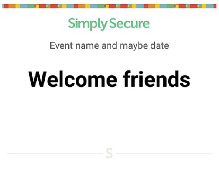
Putting together a style guide is a good exercise on its own, because it helps clarify the audience and describe the situations where end users’ will encounter the materials. For instance, at Simply Secure we knew we wanted community events, so we made sure to have event signage that included the same colorful Fibonacci sequence that’s on our website and business cards.
 Simply Secure’s template for event signs.
Style guides should be living documents, updated over time, so starting with something quick and scrappy – but open and accessible – is a great choice for an open-source project. We’re releasing ours under a CC-BY 4.0 license on our website and our Github repo, so you check it out. And, if you want help developing a style guide for your open-source secure-communications project, let us know!