Messaging with friends and colleagues is rewarding – but sharing contact information is awkward. Many people want to preserve their privacy by carefully controlling who gets their contact information, and choose not to broadcast their email address or phone number via a public Facebook or Twitter profile. Instead, they choose to strategically share their contact info.
It’s awkward to navigate the social and UX challenges in this sharing. Looking at how WeChat and LinkedIn handle this problem exposes two different kinds of awkwardness: mechanics of sharing and social agreement about what permissions you get as a result.
WeChat: Reciprocity and Leaving People Hanging
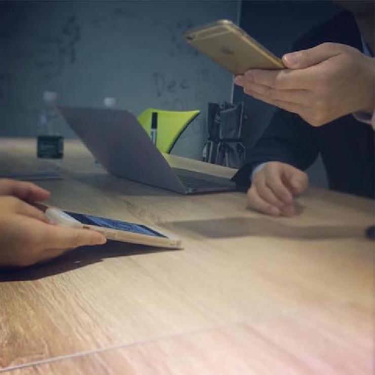
Chinese messaging app WeChat has grown to 650 million monthly users. Although posts may be censored, it’s a fixture of the Chinese mobile landscape. During 2016’s Lunar New Year, WeChat handled 8 billion “red envelopes” of New Year’s money through its payment platform. Christina Xu’s Am I Scanning You, or Are You Scanning Me shares the social nuances of scanning a QR code off someone else’s phone to exchange contact information. Her writing provides cultural context; for example, URLs are only slightly more human-readable than a QR code for most Chinese people. Her discussion of Chinese norms of courtesy and reciprocity include descriptions of the discomfort that an inexperienced QR-code scanner causes, requiring their scanning partner to “hold their phone out steadily for awkward, uncertain seconds, as if waiting slightly too long for a high five.”

Scanning a QR Code to share contact info in WeChat. Photo by An Xiao Mina, used by permission.
With WeChat, the physical mechanics of contact sharing may be awkward or difficult, but it’s clear what you have permission to do. After being scanned, you still have a graceful way to not complete the friend request if you choose. However, once the request is accepted, you can exchange messages with them on the platform, and optionally share Moments with them.
LinkedIn: Spam and Dark Patterns
Last fall, designer Frank Chimero proposed that any New Yorker cartoon could be captioned with “Hi, I’d like to add you to my professional network on LinkedIn.” These bland and unthreatening words, which the professional networking site has made familiar to many people around the world, have achieved internet memedom.
— Frank Chimero (@frank_chimero) September 22, 2015
However, these messages are not always desirable, and a specific set of UX decisions has caused LinkedIn to become synonymous with spam. Dan Schlosser describes LinkedIn’s Dark Patterns and how they trick people into inviting their contacts to connect on the social network.

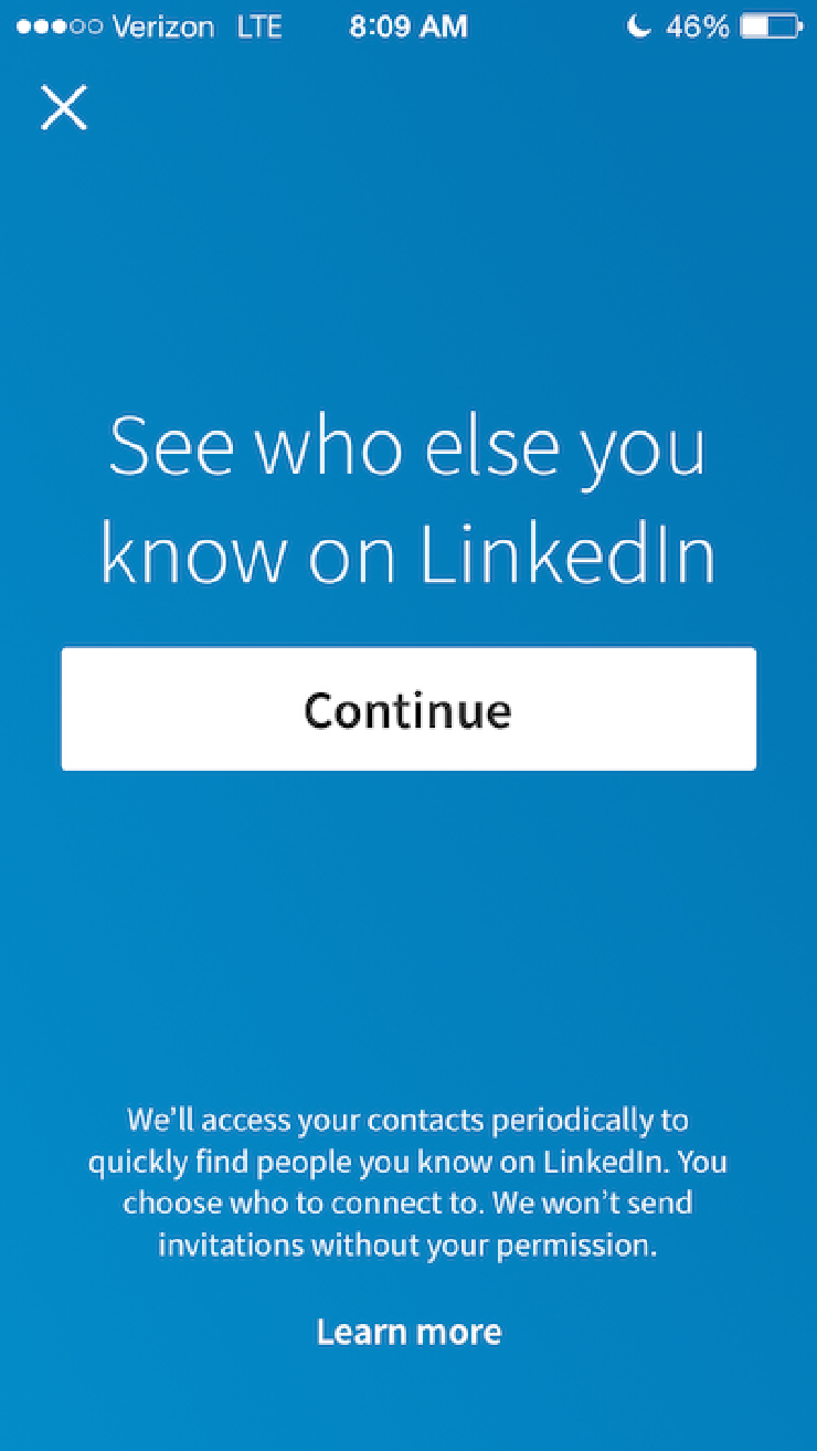
LinkedIn interrupts users’ workflow to request access to your contacts.
In contrast to the up-front awkwardness of scanning a QR code, sharing contact information via LinkedIn is downright seamless. The LinkedIn iPhone app screenshot shown above makes “continue,” which gives ongoing access to your contacts, prominent – and the “x” to dismiss the request without granting access subtle. Because the app frequently requests access to your contacts, invitations to connect can be unknowingly sent to everyone in your address book, including those you don’t consider professional contacts, such as someone you texted with to buy a used sofa.
With LinkedIn, the social awkwardness around contact sharing comes after the request has been sent. The fact that LinkedIn’s aggressive requests reached meme status indicates that these requests are often unintentional. Furthermore, there’s no social agreement on how to interact once the LinkedIn connection is made. Message only within the app? Send emails? Endorse for skills? It’s not clear what accepting the request means, because it’s not clear what the invitation-sender intended.
Designing to Share Contacts and Preserve Privacy
Deliberately increasing the awkwardness of sharing contacts would decrease usability and distract users from their primary communication goals. However, “friction-free” isn’t always good; designers should safeguard the intentionality of sharing contacts by making it explicit and noticeable. Instead of happening seamlessly behind the scenes, contact sharing should be something people intentionally and explicitly opt into. I look forward to more experiences like WeChat, where the on-screen UX and social agreements work together – even if they require a little QR awkwardness.