Users of the Facebook iPhone app were recently surprised by a new feature offering to “Add the last link you copied?” into a status update. Many people did not expect to see a complete URL that they had put onto the clipboard from another app, without explicitly involving Facebook. Christian Frichot discusses iOS security concerns with this feature, but I also consider this to be a UX design failure.

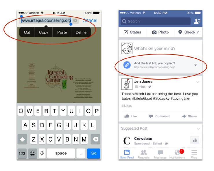
Copying a link in Safari (left) makes it appear in Facebook (right).
Consider the following example scenario: you get a reminder to share the name of a counseling service with a friend who is having a difficult time. Several minutes after copying Integral Counseling’s website URL from Safari into an email and sending it to your friend, you open Facebook and see the offer to include the link in a status update. Clicking the X in the dialog box presumably prevents Facebook from including the link in your status update, but there’s no way to keep the link from the screen or – more broadly – to limit Facebook’s access to your clipboard in the first place.
Facebook seems to be reading everything on the clipboard to see if there happens to be a link to a website. People copying any information – even passwords or personal notes to themselves, even when using encrypted chat or email – feel like they have had their privacy compromised.
Good UX Isn’t Creepy
Individual iOS apps haven’t always done a good job of exposing to the user how they access OS-level features like the clipboard and address book. Seamless access to Contacts creates all sorts of awkward situations, such as Tinder dates showing up in LinkedIn’s “People you might know”.
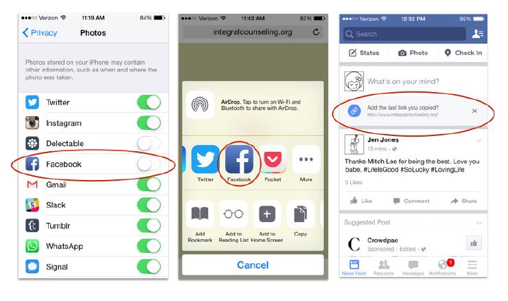
The Privacy menu of the device’s Settings lets users specify which apps have access to Contacts, Photos, and other OS features. This control panel, traditional copy-pasting, and the interface for explicit in-app sharing are the ways users understand how content gets into Facebook, a broadcast medium. Automatically pulling in links from the clipboard breaks that mental model.

Left: the Privacy menu of Settings controls which apps access OS-level functionality like Photos and Contacts. Center: within Safari and other apps that use the iPhone’s native sharing menu, Facebook shows up as a destination. Right: the iOS Facebook app automatically pulls in links from the clipboard.
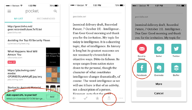
There is no setting for granting access to the clipboard; it seems that iOS provides unlimited access to all apps. There are cases where this functionality makes sense and truly helps the user: for example, reading-list manager Pocket also inspects the clipboard for content and asks to add a copied URL to your personal list. Perhaps similar functionality makes Facebook feel creepy because Pocket is about keeping your data for you, while Facebook is about sharing your data with the world.

Left: Pocket asks to add a URL to a reading list. Center: when reading a website within Pocket, there’s an option to share that link. Right: Pocket has options to share with different audiences, including via Facebook, but the default is a personal reading list.
These apps’ differing value propositions are apparent from the language on their respective home pages. Facebook invites you to “Connect with friends and the world around you.” In contrast, Pocket is about keeping thing to yourself, telling users “When you find something you want to view later, put it in Pocket.” The private nature of the app is reinforced by a mental model that Pocket is a place on your phone where you can read articles and watch videos even without a network connection.
UX designers have worked hard to create seamless user experiences where things seem to happen as if by magic. But as people’s behavior online and off is increasingly tracked, seamlessness can now easily evolve from being unexpectedly delightful to downright creepy. Facebook has a business imperative to get more content into the platform, and this probably resulted in a drive to create a shortcut around the iOS sharing menu. I encourage individual designers facing similar imperatives to push back and protect their users by advocating for good UX – in other words, UX that isn’t creepy.
Alternative: Elegant Seams
As more people become privacy aware, there’s a professional challenge for UX designers to understand the technical on-ramps and off-ramps of how data flows into and out of their apps. Elegant transitions between apps can help UX designers move from a siloed view of their product to a transitional view, designing for users to move throughout an ecosystem of apps and operating systems.
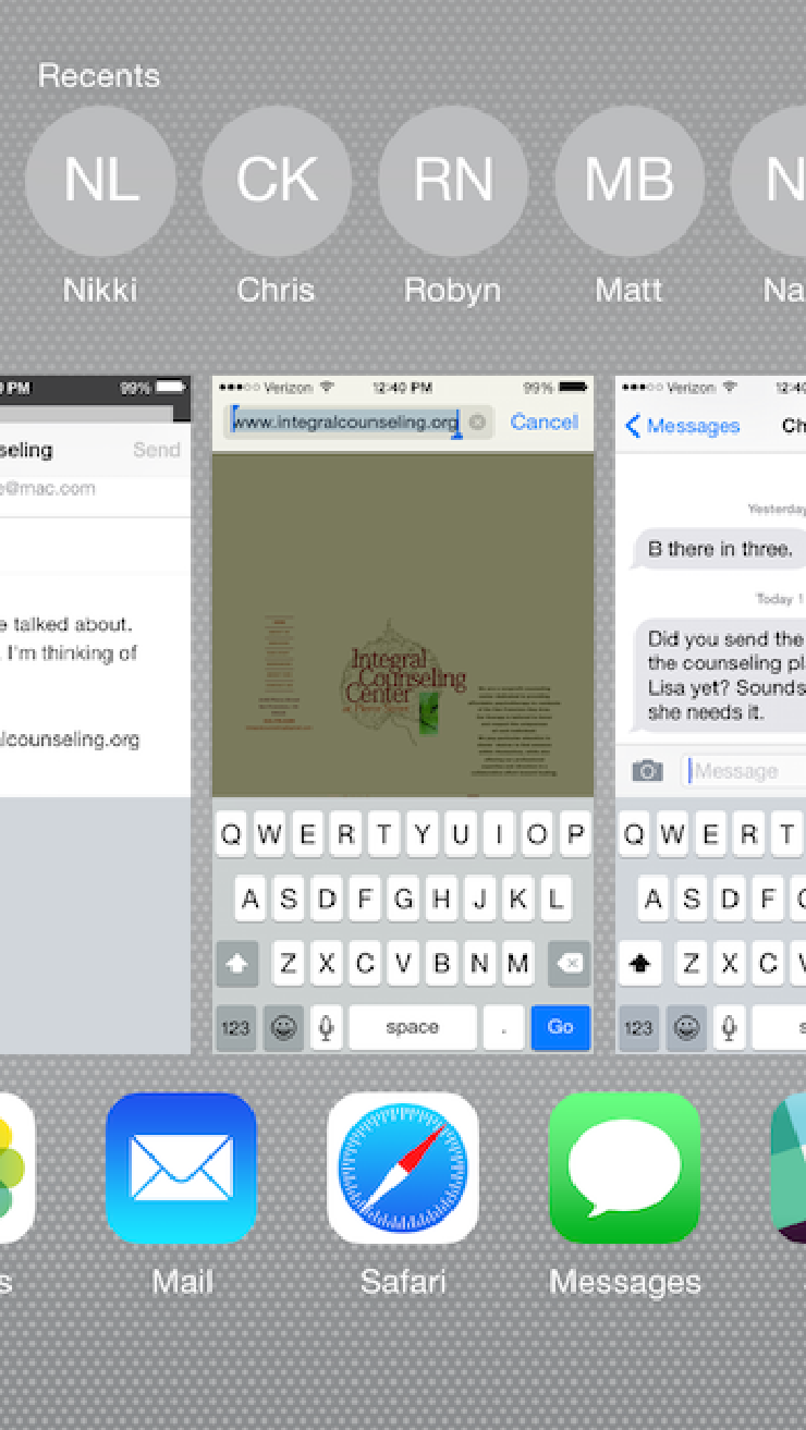
Consider how the iPhone UX evolved; it launched without a clipboard or the ability to multi-task between apps. The UX for switching between apps is still clunky, relying on a double-click to see what apps are open. And even though people now often move between apps or close apps they don’t want running in the background, the interface for multi-tasking hasn’t kept pace. Double-clicking to scroll through apps is one kind of seam, but not an elegant one.

Double-clicking the iPhone’s button shows open apps.
Surfacing the seams between apps – such as permission management and data sharing (both implicit and explicit) – is important for empowering users to protect their privacy. Rather than falling into a paternalistic trap of “making everything just work” and not “forcing the user to think” – which robs users of their agency – designers must create elegant interfaces that liberate users to manage how their data flows between apps.
One opportunity for managing seams and meeting people’s privacy goals is to use best practices from service design for helping people move between multiple experiences and platforms.
In an increasingly-privacy conscious world, “seamless” doesn’t always work. Sometimes we need elegantly visible seams.