I’ve been enjoying the videos from AI Now, an exploration of artificial intelligence and ethics hosted by the U.S. White House and NYU’s Information Law Institute. Co-chairs Kate Crawford and Simply Secure co-founder Meredith Whittaker put together a program focused on issues of social inequality, labor, and ethics in artificial intelligence.
AI inspiration
Looking at the program through a UX design lens, there were abundant design opportunities to make AI systems more effective, transparent, and fair. For example, Human-Computer Interaction pioneer Lucy Suchman called for the demystification of artificial intelligence in the video below.
Lucy Suchman’s presentation from the AI Now plenary begins at 27:30.Suchman also showed two photos side-by-side, one of an elderly woman with her caregiver and the other of an elderly man with a robot caregiver. She described the ways in which the human caregiver dynamically orients herself to the elderly woman whereas the robot cannot do the same. To me, her example illuminated how a human-centered design approach could offer improvements in the way robot caregivers interact with their human patients. One way to put Suchman’s observations to work is to design the robot with longer arms so that the man doesn’t need to lean so far forward to reach it.
Notifications as a UX challenge
Beyond hardware, there are many design opportunities for software as well, one of which is the ethical design of on-screen interfaces for AI interactions. I encourage you to read the entire AI Now summary report. In particular, the following recommendation stood out as a clear opportunity for design.
Support research to develop the means of measuring and assessing AI systems’ accuracy and fairness during the design and deployment stage. Similarly, support research to develop means of measuring and addressing AI errors and harms once in use, including accountability mechanisms involving notification, rectification, and redress for those subject to AI systems’ automated decision making. – from The AI Now Report: The Social and Economic Implications of Artificial Intelligence Technologies in the Near-Term (emphasis mine)
Notification is critical to helping people understand how their data are accessed and used, but the UX of notification is a hard design problem. On mobile phones, managing notifications is complex. Let’s begin with a few relatively inconsequential examples from everyday apps.
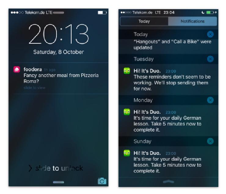 iOS notifications from food delivery service Foodora and language learning app Duolingo
These notifications sit on the border between being useful and being spam. My phone is set up to get very few notifications, but when I was experimenting with location-based services, I was flooded with spam notifications. Frequent notifications that [someone I barely know] is going to [an event I don’t care about] at [a time when I’m preoccupied] were frustrating.
Even without sophisticated context detection, these apps seem to be using the intersection of my past behaviors and the time to make inferences. For example, I might flinch when Foodora thinks that I’m at home and craving pizza at 8 P.M. on a Saturday night, but I can’t dispute that my order history makes it a reasonable assumption.
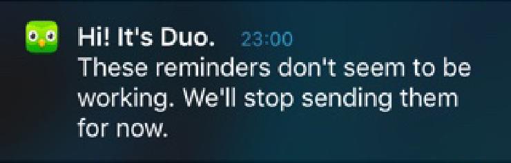
A better example of accounting for past behavior when designing notifications is Duolingo’s reminder feature. You can set reminder notifications in Duolingo, but if you don’t log in after receiving alerts over several days, Duolingo will cease to send them. Duolingo’s designers predicted that I might ignore the alerts and then designed for it. Many other spam creators could learn from Duolingo’s approach.
UX for user control
Notifications are invitations to interact with systems. They suggest that an app or process needs the user’s attention. Consider the iPhone’s settings for managing alerts. On a per-app basis, users can control which kind of notifications they want to see and how they want to see them. At first glance, it may seem like fine-grained control, but this style of notification control is already at the end of its utility.
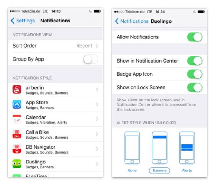 iOS notifications settings. Left: list of applications that generate notifications. Right: controls for an individual application.
Instagram notifications for popular accounts expose how the current UX can’t scale. Notifications work fine as long as an Instagrammer has a bounded number of followers, but the below video shows how overwhelming notifications can become when an account has 8 million followers. The account holder behind @433, a popular soccer Instagram account, captured what it’s like to receive so many notifications. Since posting the video, @433 has accrued another 4 million followers.
Overwhelming Instagram alerts for accounts with many followers demonstrate challenges in scaling notifications.
Towards UX for AI
In my examples, getting alerts to order food, use a language app, or interact with Instagram followers may be annoying, but the consequences of ignoring them are relatively minor. Skeptics might suggest management strategies such as not using annoying apps or having fewer followers, but people will have no choice but to use some AI systems. For some applications such as credit scoring or medical care, the consequences of ignoring a notification may be drastic, even life-or-death. As part of a larger ecosystem, poor app notification practices by less “consequential” apps threaten the utility of notifications overall. If your notifications feed is crowded with spam about your Instagram followers, you’re bound to miss a critical health alert or two.
Privacy, ethics, and consent come into play when considering scenarios such as how to alert people to automatic facial recognition in public places. Just as we have “video surveillance in use” signs, a design suggestion I have encountered is for cameras to broadcast their presence to anyone within their recording radius. The alert could also invite people to interact with the recorded data. There are already numerous challenges across law, economics, and hardware manufacturing that make this unrealistic. Even if we set those aside, when drones with cameras are as small as bugs, a person could be on tens of thousands of cameras at once. It would trigger a notification nightmare akin to Instagrammer @433’s video.
Mobile alert mechanisms aren’t designed for users to interact comfortably with a high volume of notifications. Without better UX, people can’t be effectively notified of how their faces are being recognized and the different ways their data are being used. What if they are misrecognized once in a thousand times? How would they wade through all the messages to identify and rectify the error? A poor UX will limit people’s ability to hold systems accountable.
Without better notifications, people will not be able to identify misjudgments by automated systems and redress them, and this has potentially devastating personal consequences.
Challenges for tomorrow’s designers
The social, economic, and ethical implications of AI systems are critically important, and as designers, we must push the frontiers of UX to accommodate these new and proliferating systems. UX for AI is an emerging field, and we need to reimagine training and support for designers who are building their professional practice in this area. What projects are doing a good job at UX for AI or notifications in general? Let us know at [email protected] or tweet us @simplysecureorg