My last post examined the concept of phishing, which is a type of social-engineering attack to con people into divulging private information like passwords or credit card numbers.
When you look for advice on how to protect against phishing, most of what you’ll find is tired wisdom such as “check the email carefully” or “never click on links in emails.” This type of advice assumes that the burden is entirely on would-be victims to protect themselves. While there are important steps that everyone should take, design and security professionals must do more than simply blame users.
In this post we’ll examine some things that you can do to fight phishing and help your users develop healthy security habits. In a future post, we will explore some of the technical ways web browsers do the same.
How designers and front-end devs can help
Phishing isn’t just a technical problem, it’s a human problem. Here are some concrete human-centered tips for fighting phishing.
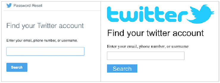
1. Consistently polish your designs. One simple action is to make sure that the UX of your organization’s emails and websites are consistently polished. While this is not foolproof (it’s easy for a phisher to hire an unethical designer to replicate what you do), polished designs raise the bar for phishers and make it easier for users to recognize poorly-crafted impersonations. Make sure that not just the welcome email and the homepage are refined and on-brand but also lesser-used designs such as those for password resets. Defining and adhering to a formal style guide can help you maintain consistent polish.
 It’s harder for users to fall for a phishing attempt if they’re used to seeing refined designs everywhere (left) than if they are used to seeing the occasional page whose design has been neglected (right).
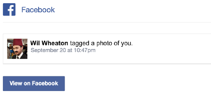
2. Consider the habits you encourage. Many social-network companies use email updates to increase user engagement. These emails can unintentionally condition users to click on links that will prompt them to sign in. For example, Facebook sends me an email whenever someone tags me in a post or photo (it’s possible that newer users of the service have to opt in to these notifications), and this has habituated me to seeing notifications in my inbox. It would be easy for a phisher to lull me in by crafting an attack based on this message. If the linked page mimicked the real Facebook site, I might end up falling for the attack.
 Email messages like these train users to click on links and sign in to their account on the web page that pops up. Phishers can easily craft a message that takes advantage of this habit.
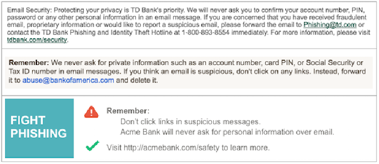
3. Tell users what you don’t do. Emails from financial institutions frequently append anti-phishing boilerplate to their emails. While these additions communicate important information about things that the bank will never do (in particular, ask for sensitive information over email), few users probably ever read or learn from them. Work with your design team to brainstorm ways to communicate this information more clearly. For example, would it make sense to send a brief and engaging email to your users on an annual basis? Are there opportunities to share similar information at key points in your users’ workflows, such as after they’ve reset their password? Or are there ways to make the email footer more eye-catching?
 Boilerplate anti-phishing text from TD Bank and Bank Of America, followed by a potentially more eye-catching alternative.
4. Make user-friendly URLs. People who are equipped to assess the authenticity of your site by looking at its URLs find it a valuable signal. Try to identify the URLs that people are likely to link to, and make them short and reasonably easy to decode. People have a harder time evaluating long URLs when they wrap to multiple lines or scroll off the screen in a browser window. For example, if you’re trying to track click-throughs on your most recent email campaign, consider a system that allows you to use a link like http://acmebank.com/signup/?id=43289s32, rather than http://acm.us2.list-manage.com/track/click?u=db7c289db00f46d096f56f14a&id=e70bf2b789&e=c0e9ebec4f.
5. Don’t use shady alternative domains. If your organization’s main website lives at https://acmebank.com, don’t send your users to sites such as https://acmebank.billpay.com or https://billpay.com/acmebank. Using third-party vendor domains can train users to expect unfamiliar websites as part of your communications and make phishing attacks with shady domains seem more credible. The cost savings associated with using these domains may be outweighed by the frustration that your users experience from getting phished.
6. Support two-factor authentication. Allowing users to configure two-factor authentication using their mobile phones is the single strongest protection that you can offer. Two-factor authentication requires users to sign in with both their password and a one-time code either generated with a smartphone app or received by SMS. (Note: members of the security community consider app-generated codes to be much more secure than those received over SMS, especially when users live in countries where the cellular network may be surveilled.) Even if users fall prey to a phishing attack, the attacker will not be able to use their password to access their account at a later date. It can take a significant investment to support two-factor authentication, but the protection it offers is unparalleled.
These are just some ideas of how you might protect your users from phishing. Happily, you aren’t alone in the anti-phishing fight; there’s a lot going on in users’ web browsers, too. I’ll explore some of this work in my next post.
In the meantime, tell us about your experiences. If you’re a designer, what have you been doing to fight phishing? Do you have a particularly egregious example of a third-party vendor site? Share it with us on Twitter or in our Slack channel.