Last month, I wrote about the importance of visual design for creating compelling software and shared resources for learning about color and choosing a good color scheme.
I also cautioned readers that using color in “moderation can go a long way toward making your project look professional and credible.” Today’s post will dissect that advice in greater detail.
Use color as an accent
Color is great for logos and accents — it makes a statement, it conveys personality — but it can also overwhelm users when it dominates the main body of the interface. Designers use color to focus people’s attention on the most important content, and a little bit can go a long way. Whites, grays, and blacks may seem visually boring when you have a rainbow of options to choose from, but they provide a neutral basis that allows the colorful elements of your UI to stand out.
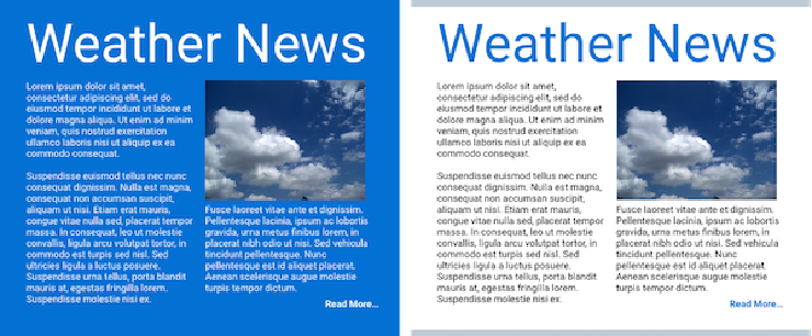 Newsletters and other information-heavy designs are particularly well-served by light backgrounds. When choosing a color for a graphic element, don’t just select an attractive hue; first examine the importance of the information it conveys and whether it deserves to be highlighted.
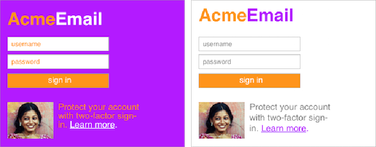 A white background and gray text in the text fields makes the sign-in flow to the right more approachable and professional. This color combination also helps the actionable elements – the button and the “Learn more” link – stand out more. Photograph used under CC BY-SA 2.5.
Neither too bright nor too dark
In order to present your user with an engaging and warm experience, try to use light, neutral tones as the background for the majority of your interface. Unlike software developers, who may find light text on dark backgrounds easier to read, members of the general public can interpret dark colors as unfriendly — sometimes threatening — which just makes things harder if you’re trying to build software that inspires confidence and trust with new users. Avoid using black or dark gray unless you are confident that your target audience will interpret it as a cultural reference (as is the case when you’re catering to hackers or there is a functional reason for a dark background (e.g. when it’s a tool for working with color or when it’s an optional customization in a text editor).
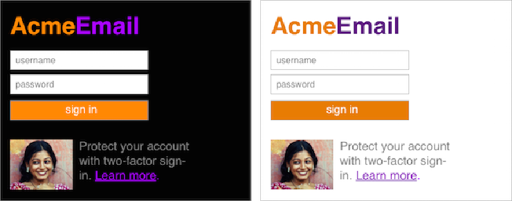 Avoid dark backgrounds as a general rule. If you want to convey a serious feeling, consider using darker shades for your accent colors.
Don’t over-saturate
Highly saturated colors should be used carefully. Saturated colors can suggest liveliness and cheer but can easily go too far and make it painful to look at the interface.
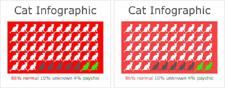 The graphic to the left uses #FF0000 for its red, which has a saturation of 100%. The graphic on the right uses #FF4040, which is a tone of the same hue and brightness that has a saturation of 75%. The difference is subtle, but it makes the contrast with the colors and repeated pattern of the cat outlines a little less jarring.
If you don’t know how saturated a color is, look at the “S” value on an HSB (hue, saturation, brightness) color picker in an image-editing program. The more saturated a color is, the closer its value is to 100. The Simply Secure color palette is bright and cheerful with a variety of hues but balances this brightness by dampening the saturation.
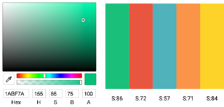 To the left, the Sketch color picker displays the values for hue (H), saturation (S), and brightness (B). To the right, Simply Secure’s color palette has been labeled with each color’s saturation value.
Think expansively and find a friend
Even people who have spent years studying the subject have a hard time getting color right. When you’re working on a new palette or layout, we recommend that you ask a color-savvy friend who is removed from the work to give you feedback. Instead of a single design that they have to give a thumbs-up or thumbs-down to, present multiple design directions and have a conversation about the advantages and disadvantages of each. When possible, repeat this process several times, ideally with different critics.
Privacy-preserving technology is important, and color can make it approachable to a broad audience. As with many aspects of software, aiming for simplicity and elegance in color is usually a safe bet. If you don’t know where to start, try finding inspiration from other technologies that are designed to appeal to a broad audience. Otherwise stick to the basics: use a clean and light background, don’t over-saturate, and focus on using color to accent the most important information. This will help you create a design that is approachable, useful, and conveys trustworthiness.
If you need a friendly pair of eyes to take a look at your latest creation, please consider joining the #design channel of our Slack community! You can request an invitation by emailing us at [email protected].