If you’re new to UX design, wireframing is a powerful tool to understand how users experience your software. People with technical backgrounds benefit from wireframing because it forces them to take a step back from their coding mentality. Rather than focusing on the technical architecture, wireframing exposes the user-experience structure: how the user moves from one screen to another.
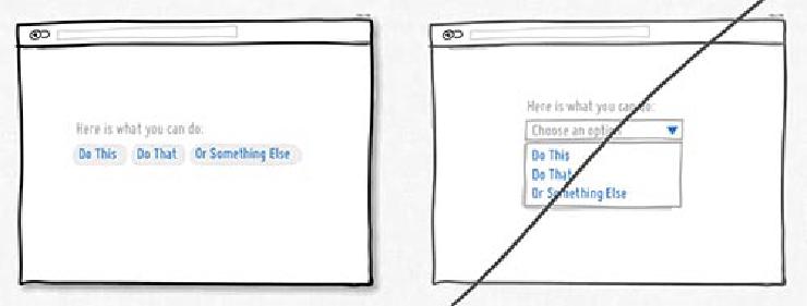 Example wireframes taken from GoodUI.org. Both show the same content organized with two different structures, but the left wireframe is better because it discloses choices rather than keeping them hidden.
Wireframes are useful because they offer a stripped-down, visual experience made up of plain boxes and lines—no formatting, no styling, no graphic design. That’s right; improving your UX skills starts with abandoning colors and styles. If you can draw mostly straight lines, you’ve got what it takes.
Why wireframe?
Teams use wireframes at many points during the design process. They can use it to conceptualize a design, to critique their design internally, and to get reactions from testers. Here are three advantages of wireframing:
-
Start off right.
If you’re implementing a new feature, start by analyzing how a different app handled a similar challenge. The act of sketching wireframes can trigger different thought processes and impart a deeper understanding than what you would get by just looking at an interface on screen. -
Get user feedback faster than with code.
It only takes an afternoon to complete a set of wireframes. If you’re not sure which features need to be implemented first, experimenting with wireframes and seeing how testers react is a smart investment. -
Find the problem.
Is something about your app confusing to people, but you can’t figure out how to fix it? Support tickets and pull-requests can only go so far. Sitting down to wireframe some alternatives can help your team untangle its thinking.
The 90-minute-no-drawing-skills-needed wireframe boot camp
Wireframing is a quick way to validate your design. It saves on wasted development time, and anyone can do it. When you are ready to test out a new interface, wireframing will help you drill down to the best UI and help you organize your development priorities.
You can start wireframing with little more than an hour and some basic office supplies. There are numerous apps such as Balsamiq and Sketch for making wireframes, but doing it by hand is more effective when you’re new to the process. Don’t waste time mastering wireframe software; spend that time building your UX acumen.
Materials needed:
- Paper
- Black Sharpie marker
- Grey Sharpie (could be something like a highlighter, too)
- Different color marker for callouts (traditionally red)
- Optional: window to the outside for easy tracing
First, pick the website or app you want to analyze. I picked Twitter’s iOS app as the basis for my wireframes in this exercise. Even though I know the app well, taking the time to wireframe it helped me see the app more critically, and what I learned from wireframing will inform my design choices for similar apps.
Make Paper Printouts
This tutorial works by tracing an existing app or website. To do that, you need paper printouts. If you’re analyzing a website, just print every page. If you picked an iOS app like me, here’s one way to print from iOS:
-
Capture screenshots of the screens you want to work on. I did this on my iPhone by pressing the power button and soft button at the same time. I sent the screenshots to my laptop, which is connected to a printer.
-
On a laptop, open every screenshot image and merge them into one file. You can do this on a Mac by using the Preview application to open the images. Go to View -> Thumbnail menu option and drag thumbnail images from different files into one thumbnail tray. Now you have a multipage file.
-
Decide what scale or size works best for your needs.
-
Below, you can see what the screens look like when printed in the “4 up” setting from the Preview application. This is a good layout for mobile apps because it mimics a small screen and is easy to cut down to size.
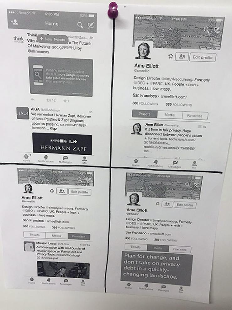 Image of screenshots in “4-up” setting.
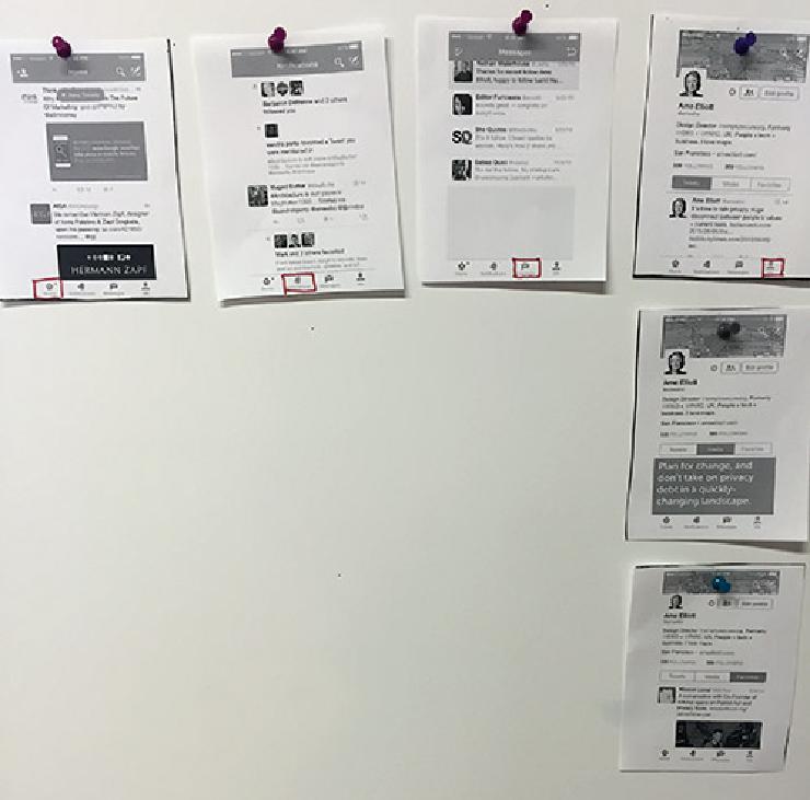 Image of pinned-up architecture.
Cut out each screen to lay out the architecture. The typical way to lay out architecture is to make every item in the top row a global navigation choice. In the top row of my cutouts, I drew red squares around specific global navigation buttons to indicate the current state of the app. Each item underneath the top row represents a substate. In this example, only the “Me” column to the far right has other substates beneath it.
Sometimes it’s easier to work with enlarged wireframes so there’s plenty of room to write out button names. In this example, I use words instead of icons to indicate what the buttons do.
If you want to work with an enlarged version of the screen, you can sketch based on what you see on screen, but if you’re not used to sketching, you can start by tracing your printouts. You don’t need any equipment other than a window to do this. It works best if it’s brighter outside than inside. You can see the result of my tracing below.
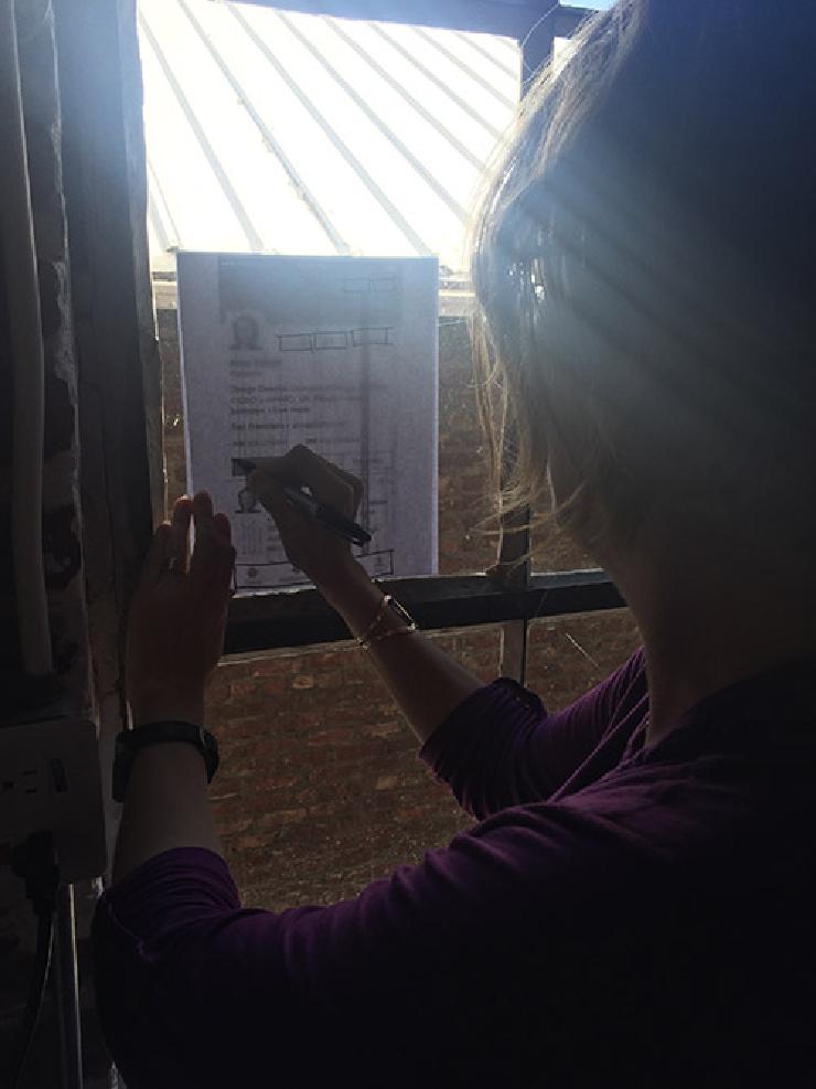 Tracing at a window.
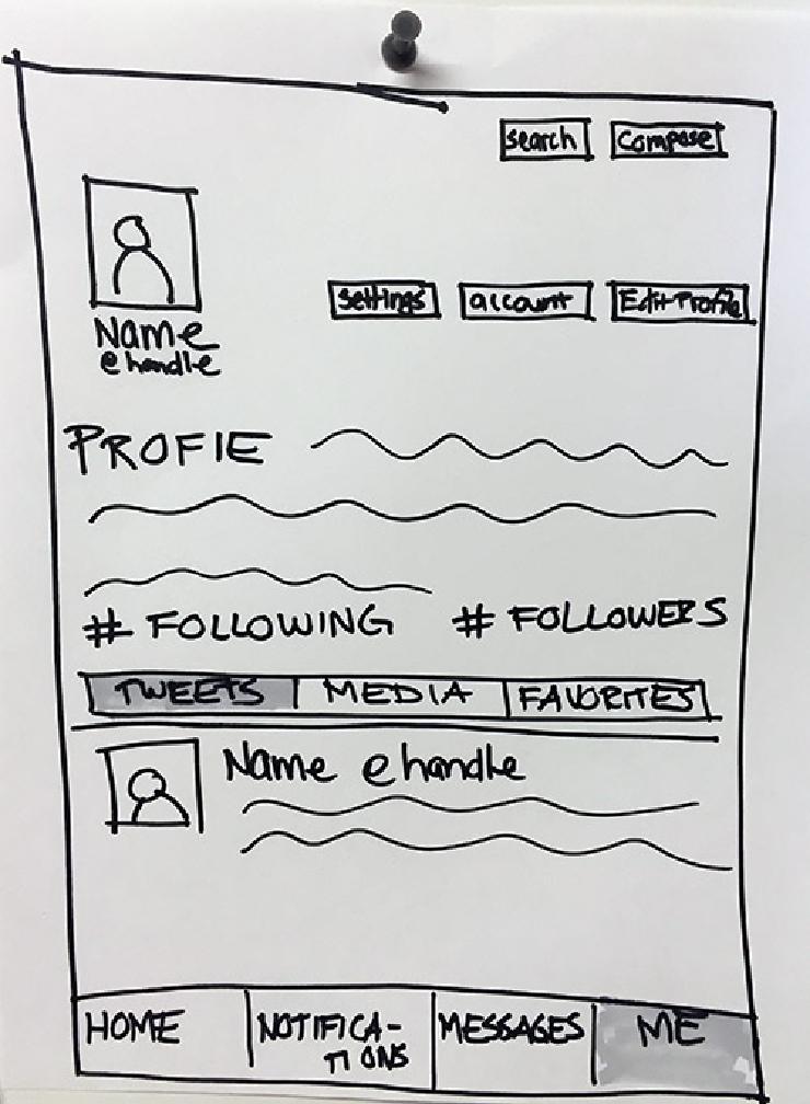 Tracing result.
Wireframing at the right level of abstraction
Since navigation is the focus of my wireframe, I only use color (gray shading in this case) to indicate what state the UI is in. Use abstractions such as wavy lines or lorem ipsum copy to represent user-generated content. Abstract representations keep testers focused on the navigation.
Other elements can also cause confusion, even if users are generally familiar with them. When getting user feedback on a Twitter wireframe, things like “Name @handle” can be distracting. To avoid this, use something made up but recognizable like “Marie Curie @mcurie” if you plan to show that element to testers. If the audiences for your wireframe are people who are comfortable with pseudocodes, using “Name @handle” probably won’t throw them off, and in those cases, that level of abstraction is fine.
These images show a progression from screen printout at left to the most abstract zones of activity.
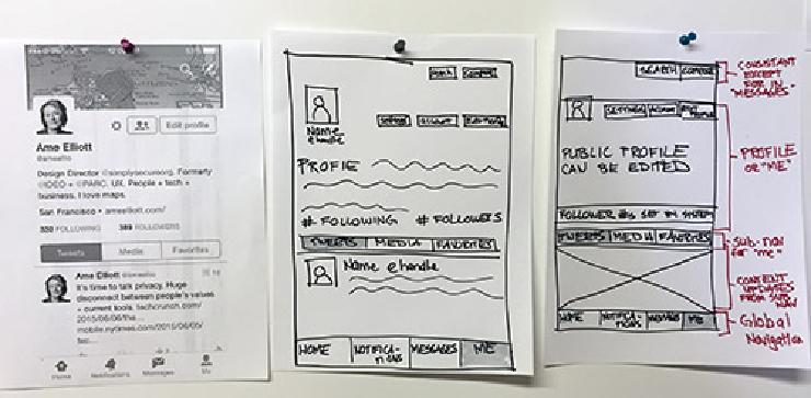 Levels of abstraction.
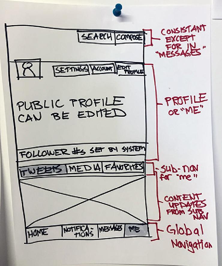 An more abstract wireframe.
The red writing are callouts that describe what activity happens in each zone, with an emphasis on navigation.
The next image is even more abstract, and it raises the question: Why are there four different button blocks spread across multiple zones?
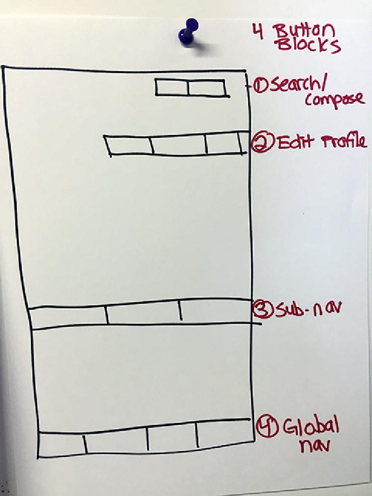 Zones of activity.
This wireframe of the Twitter iOS app really spotlights the trade-offs in navigation. There are four different areas of navigation (why?), and instead of using hamburger-, sidebar-, or other types of menus, the designers settled on buttons. There are positive and negative tradeoffs here. On the one hand, the buttons are self-disclosing, and it is immediately clear what sort of operations are possible. On the other hand, there’s a lot of clutter, and users have to look in multiple places to perform the operation they want.
To practice wireframing, I suggest:
-
Draw whatever you’ve been working on, regardless of its state. Much like handwritten notes, even an hour of drawing helps me understand the logic behind the system.
-
Look for a widely admired version of the feature you’ve been working on. Sketch out a wireframe of what you find and then sketch out your version. Tools that have mass adoption have generally achieved high usability. Wireframing Amazon’s shopping cart gives a good understanding of what a successful cart needs. In this case, Twitter is a reasonable place to start if you want to understand the logic behind a complex communication app.
-
Analyze the similarities and differences between the other version and your version of the feature. What considerations underlie those design choices?
-
To set a benchmark for user profiles, you can make a series of wireframes by looking at popular services that have user profiles and using them as points of comparison.
-
Take a look at guides like this one on 10 best practices for wireframing.
Wireframes Trigger Insights
Have you ever given a slide presentation only to see a typo that you didn’t catch beforehand? Even though you rehearsed many times, the typo didn’t leap out at you until now. When it comes to UI, wireframing ensures against this. Like the exercise in this post, wireframing an app that you’re building will quickly reveal problems that you didn’t expect. Wireframing takes you out of the code and offers another context to critically examine engineering and design choices.
Whether you’re working solo or on a team, wireframing is a quick and powerful way to think about the structure of your app and to prioritize improvements.
Going Deeper
-
Christina Wodke is one of the first information architects. She has years’ worth of excellent posts on Boxes and Arrows. Mythic Design, one example of her many thought-provoking pieces, addresses the limits of wireframes.
-
Abby Covert’s How to Make Sense of Any Mess is a quick read and a classic resource on how to structure content.