We worked with developer and designer Gina Giampaolo to refresh the Code for Science & Society website in 2022. We caught up with Gina to reflect on the project and talk about design in civic tech.
In 2022, we were lucky enough to work with Code for Science & Society to revamp its website. We partnered with designer and developer Gina Giampaolo to:
- Refresh the look, feel, information architecture, and navigation of the website so that it clearly communicates the organization’s mission, vision, and programs.
- Improve and simplify the experience of editing the website by implementing a well-documented, easy to use CMS.
For non-profit organizations, websites play many roles. A website not only showcases the organization’s mission and vision through its declaration of values and brand identity, it often acts as a repository of the org’s work. Sites act as a catalog of past and current projects and their impact, a resource library of useful and replicable content for the community, a source of event and gathering information, and a key place to talk about what they do on a day-to-day basis. We recognized through this and other similar projects that an organization’s website is actually critical digital infrastructure for serving its mission. So taking it seriously and deeply understanding the needs for CS&S’s unique case was critical.
From concept to reality
Understanding the website as a critical hub and resource for CS&S, we dug into the goals, needs, and desires that CS&S staff had for their site through user research. After 12 interviews with staff and stakeholders and one focus group, we landed on some key findings about its old website:
- The site’s content was buried, out of date, and not easily navigable.
- CS&Ss program strategy and the impact of their programs and fiscally sponsored projects were not effectively showcased.
- The team wanted to have more agency in editing and maintaining the website, but the infrastructure wasn’t usable or well documented enough to support them. As the org had grown, multiple websites were created to fulfill different needs, and each used different website hosting technologies and had different editing processes, which made it very difficult for the org to maintain.
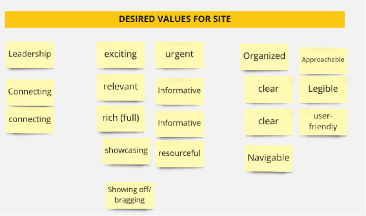
We also landed on common values for the future of the site:

From there, we worked on the Information Architecture needed to unify the disparate sites into one main hub, expanded the existing CS&S brand to work for the web, and designed the UX and UI of the website, and set up a holistic CMS with the fearless direction of Gina Giampaolo. We decided to interview Gina about her experience working on the project since she played such a critical role. We’re happy to say the CS&S website has been up-and-running successfully for about a year now!
Interview with Gina Giampaolo
Introduce yourself!
I’m Gina Giampaolo. I’m a developer and designer living and working in Portland, Oregon. I went independent back in 2021 and since then have been building websites that help organizations and individuals wrangle lots of data in useful ways. I’m a competitive powerlifter and love big trees, video games, sewing garments, and all things fiddly and complicated.
How did you become familiar with CS&S and its work?
I used to work at Rumors (RIP) with Andy Pressman, who is Danielle Robinson, the Executive Director of CS&S’s partner. So I’ve basically just been in the neighborhood for a long time, ha! CS&S supported a short-lived meetup called Dat Night (also RIP) that was all about introducing Dat (and another RIP) to non-developers, specifically artists and makers. I worked with them a bit back in 2019, and again in 2021 providing website support and some design work, before we started on the CS&S site rebuild in earnest in 2022.
Tell us a bit about your approach to design and development
My favorite things to build are applications that unite a lot of disparate data and processes in one place in a way that both supports the people using the tool and presents information clearly. I want the editor experience to be just as good as the front end user experience. This is an interesting challenge that has come along with the explosion of website building tools and frameworks — you have to actually design and build, not just the end user experience of the website, but the editor experience. A good, usable editor experience is critical for small organizations as they don’t often have a dedicated web team or communications team, and the website is the platform for their organization.
What, to you, is the importance of design in the world of public interest tech and science? What motivates you as a designer and developer in the space?
I think that design can facilitate the communication of the really complex and exciting ideas that are often kicking around in public interest tech, and demystify that complexity – understanding a process is the first step to supporting it.
What about this process was most exciting to you when we got started?
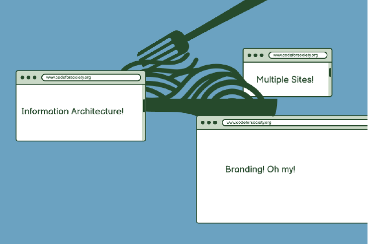
Okay so CS&S had a lot of websites, which I think is normal for an org like this that’s running events, starting initiatives, taking on new projects, etc. There was a lot of digital spaghetti to untangle, and the idea of getting it sorted into a new supportive system was very satisfying.
What part of the website or system you created are you most proud of?
Resources! Originally, we hadn’t planned to focus on the resources at all, but once we got talking about it it was impossible to not build it because everyone was so excited about it. Resources and knowledge development are core to CS&S’s DNA and mission as an organization, so not developing this key functionality would’ve been leaving them with a website that didn’t meet their needs nor their mission and vision.
What part of this process was the most challenging?
It’s always hard to communicate just how “loaded” a design is. The schema is represented in the content shown, but the structure of a page or section mirrors content hierarchies that are set up in the back end in often much more complex ways.
What are some challenges you’ve encountered working as a designer and developer in the open-source, public interest, and/or nonprofit space?
In terms of design practices, there are too many cooks in the kitchen sometimes, flatter organizational hierarchies sometimes mean random people show up with a whole lotta feedback and you’ve gotta manage expectations around that, but politely!
In development, open source at all cost is sometimes restrictive … but I get it. Lots of excitement about new tools that get quickly abandoned and become unusable, so you can end up with a graveyard of statically generated sites pretty quickly.
Lastly, lots of extremely knowledgeable people and institutional knowledge that never makes it outside because there’s not a concerted effort made to communicate those ideas effectively to outside audiences. Good stuff gets trapped in brilliant brains!
What’s next for you?
I’m building a subscription platform for a friend using Craft CMS, yet another case of pulling a whole lot of disparate stuff into one place in a way that is easy to use and functional for her needs.
Credits
Project Contributors: Susan Kennedy (now at Open Technology Fund), Katie Wilson, Gina Giampaolo, CS&S staff including: Danielle Robinson, Joe Hand, Page Metcalf, Jessica Hardwicke, Moni Awolesi, Rayya El Zein, and Angela Okune.