- Amnesty International asked us to help improve user accessibility and trust for PhishDetect, an open-source browser extension that helps at-risk users mitigate phishing attacks through a coordinated human network.
- Our team used a research-intensive approach to modernize the tool’s design, clarify its language, and leverage consistent graphics to enhance user comprehension and assurance.
- The result is a safer online experience for those working to advance equality, safety, and transparency around the world – and therefore a better product for everyone.
Everyone faces risk from online phishing attacks. Due to the nature of their jobs, human rights defenders and activists face a heightened threat level from authoritarian actors who don’t uphold human rights. Aware of the increased danger this problem poses to its community members, Amnesty International recently decided to support PhishDetect - an open-source browser extension that helps at-risk users mitigate phishing attacks by empowering a coordinated human network to identify, report, and avoid potential threats. Through use of the extension, network members are able to pool their information and collectively reduce the likelihood of successful attacks on their communities. Like a school of fish, a PhishDetect network is stronger when its users work together.
Because increased community participation makes PhishDetect more effective and keeps more people safe, Amnesty International came to Simply Secure in June 2020 to help improve the tool’s usability and accessibility prior to launch. No strangers to using design to increase user safety and awareness, our team set about modernizing PhishDetect’s design, clarifying the tool’s language, and leveraging graphics to enhance threat comprehension. Project success would mean not only a better product - but a safer online experience for those working to advance equality, safety, and transparency worldwide.
Diving in
Our human-centered approach began with a series of initial coaching sessions through which we became familiar with the unique needs of PhishDetect. By analyzing similar tools, studying the user journey, interviewing experts and users, and conducting workshops, we were able to distill four guiding principles for the project, the tool, and its user needs:
- PhishDetect is a practical, not educational, tool.
- Reassuring users is just as important as warning them.
- Users have agency to make their own choices.
- PhishDetect is a community effort.
Though these key principles were far from obvious at the outset of the project, they proved to be invaluable resources as we iterated, tested, and refined new brand and UX designs. They also helped us solve complex problems like determining how much interference in routine users would accept (PhishDetect is by definition disruptive in preventing people from visiting suspicious websites). We knew we wanted to increase friction in risky situations, but how much friction would be too much? When would too much disruption actually hinder safety by increasing annoyance? Research in hand, we were able to craft a compelling visual identity for PhishDetect (including a mascot, metaphor, and logical ecosystem) and improve overall usability through enhanced UX.
Changing tides
In making the web extension more intuitive for users, our team addressed a host of PhishDetect features including the onboarding process, menu icon, in-browser pages, tool settings, email integration, and website. The examples below provide three snapshots into this design work.
Creating a new visual identity
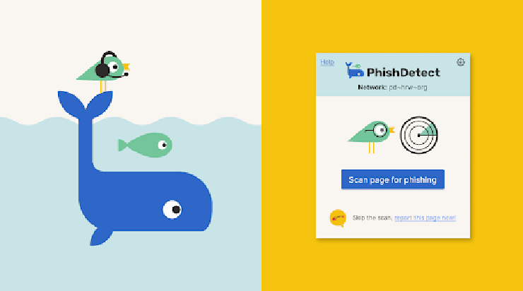
It quickly became clear from our research that PhishDetect needed a new visual identity to help users better recognize the tool, utilize its offerings, and understand their role in the ecosystem. Unlike providing code (which few people have the time or expertise to decipher), a visual metaphor creates stronger lines of communication between the extension and user. Likewise, visual consistency signals trust and can provide assurance in otherwise stressful situations. In partnership with brand designer Guille Lasarte, we therefore created a PhishDetect metaphor, in which the bird and whale (Network admins) help the school of fish (users) work together to avoid pollution (phishing). Though these characters come from different species, they happily work alongside one another to keep the ocean (the community) safe for all.


Designing a toolbar pop-up
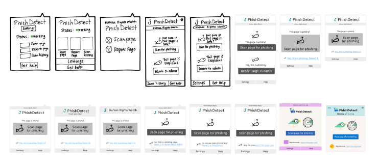
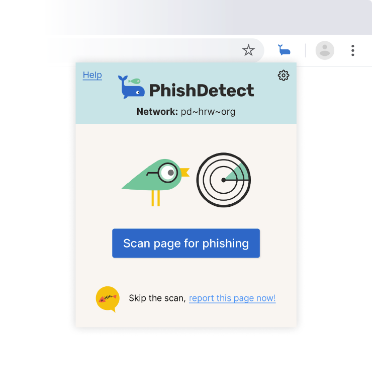
With an emphasis on making user goals easier to achieve, we designed PhishDetect’s toolbar pop-up to reassure, save time, and reduce frustration. To help users make quick decisions, we utilized a hierarchy system in which the primary action (“scan”) is prioritized visually through placement and size. This method maintains user agency as the secondary action (“report”) is accessible, although placed lower and smaller on the screen. A “help” button linked to reassuring information on the PhishDetect website is also provided throughout. At each iteration of design, we focused on PhishDetect’s practicality and worked to simplify language and enable images to convey the desired message.
Toolbar pop-up - Design Iterations:

Toolbar pop-up - Final Design:

Changing what users see when a phishing webpage is blocked
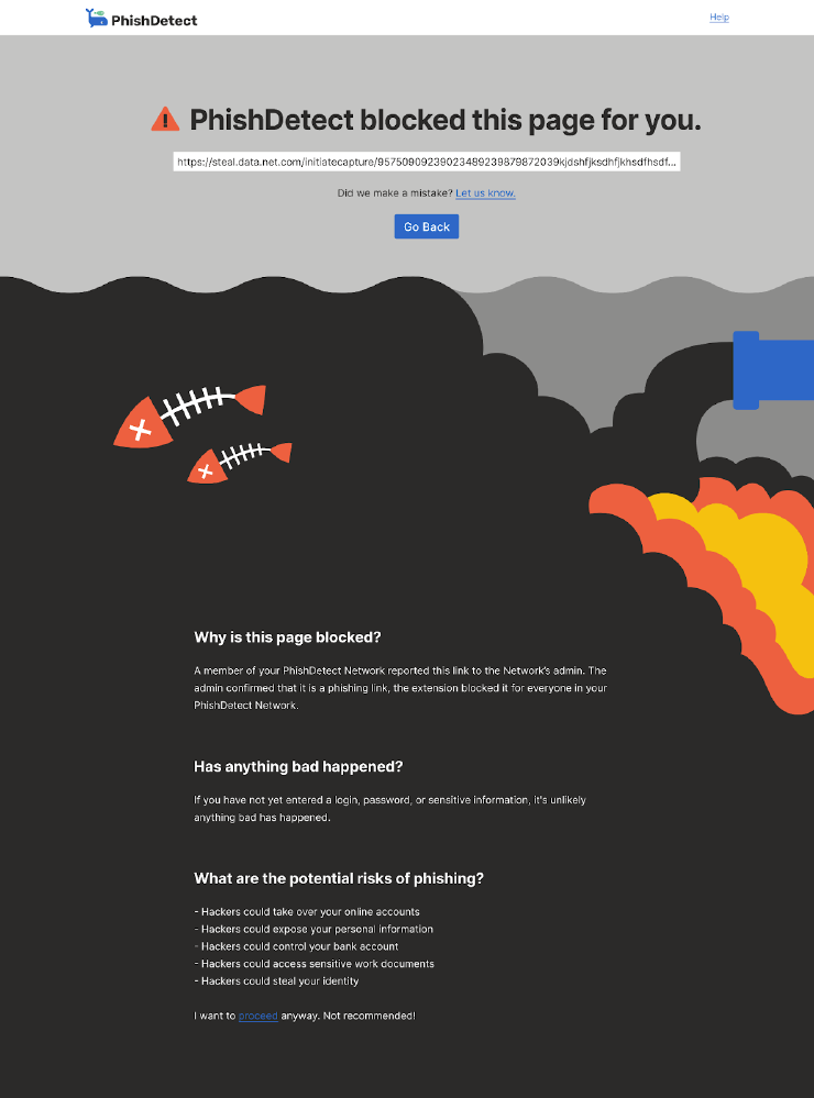
Thanks to our redesign efforts, when a user clicks to visit a phishing website, PhishDetect automatically redirects them to an interstitial block page that relays the threat without causing panic. Building on the visual identity discussed above, the metaphor image and accompanying text clearly and quickly clarifly what is happening and why. This information enables users to make informed choices by first explaining what happened (“Why is this page blocked?”), and then balancing a warning (“What are the potential risks of phishing?”) with reassurance (“Has anything bad happened?”). Because PhishDetect users ultimately retain discretion to do as they please, the path to “proceed” is located at the bottom of the page (after the warnings), indicating it is not the safest option - but an option nonetheless.
Phishing block page:

Swimming forward together
So what’s next for PhishDetect and its future users? Going forward, the PhishDetect team is working on implementing the new designs and further testing. After the tool’s official launch, community and organization members will hopefully feel a bit safer online - empowering them to take on new and more challenging tasks, secure in the knowledge that they have the protection of PhishDetect on their side. Bottom line: When a tool’s success hinges on human participation, human-centered design is a must. There’s never a more important time to meet users where they are, understand their needs, and then design a solution catered to address them. By taking the time to understandPhishDetect’s users and unique context, our team was able to unlock the tool’s incredible potential to protect not just individuals - but entire networks of frontline defenders and at-risk communities.
Credits
Project Lead, UX, & UI Designer: Kelsey Smith
Design Direction: Ame Elliott
Brand Designer: Guille Lasarte
Concept & Implementation: Claudio Guarnieri