It can be hard to communicate about security-related features with users who aren't already security experts. From word choice to the level of detail included, it's easy to overwhelm people with information, leave them scared, or bore them to indifference.
For many applications, one major challenge is finding the right place to communicate. Empty states – screens in your app where there is no actual content to display – are a great opportunity for this communication, in part because they frequently occur when the user is first starting out. Here's a sampling of empty states from a variety of platforms, and a piece on designing great empty states in general.
Incognito Mode vs. Private Browsing: Scannability Wins
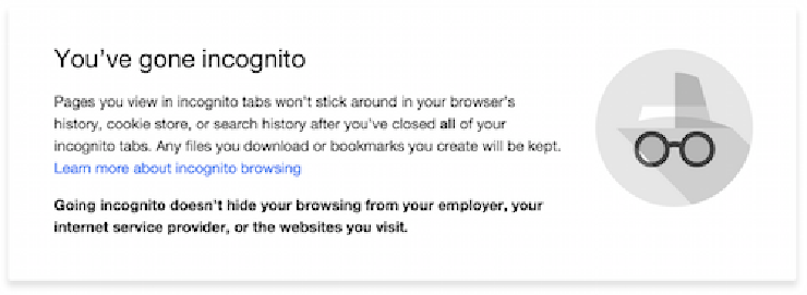
As a mini case study of how empty states can be used to communicate about security, consider the initial pages for Incognito Mode in Chrome and Private Browsing in Firefox.
 Incognito mode empty state, Chrome version 47.0.2526.80
Both take advantage of the empty state associated with a new browser window to communicate both the benefits and limitations of the feature. They both share that their respective features prevent some data (like cookies and search history) from being recorded by the browser, but preserve other types of data (like downloaded files and bookmarks). Both screens also communicate that the features don't protect the user from surveillance by ISPs or employers providing internet service.
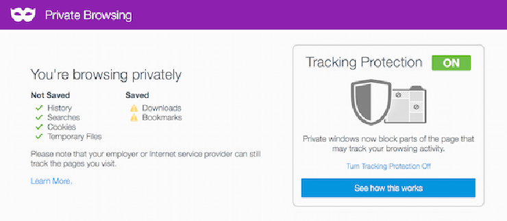
 Private Browsing empty state, Firefox 42.0
In comparing the two, though, the text in Firefox's empty state stands out as being more scannable: it's easier to extract essential information from it without having to read it carefully. Specifically, the use of lists, bold subheadings, and icon bullets helps the reader 1) learn that Private Browsing doesn't keep everything private, and 2) extract details on what is and isn't retained while using Private Browsing.
When you're setting out to communicate complicated concepts to your users, working to make your textual content more scannable is one quick and easy step you can take. Reflecting the meaning of the text in its structure – e.g., dividing benefits and limitations into two bulleted lists – reduces the burden on the user in trying to understand your material. And, this structure helps you resist the temptation to make your writing complex in an attempt to be precise. It's better to be simple in the main interface and provide a link to more information for users who want to learn more.
For other ideas on how to make your interface text more scannable, check out The Nielsen Norman Group's handy list of tips and illustrative examples.
There's Always Room for Improvement
Although the Firefox Private Browsing empty state wins out over Chrome's Incognito Mode as being more scannable, its design could still be refined to help new users understand the feature better.
For example, the green checkmarks under "Not Saved" convey confidence, but the caution symbols (which are affectionately referred to as "party hats" on the Simply Secure Slack channel) can be ambiguous. If the point is to help users understand that saved downloads and bookmarks can be problematic, wouldn't something along the lines of a red X be more clear?
This brings up an interesting conflict between the positive and negative words and their corresponding icons: the negative heading ("Not Saved") has positive icons (green checks) and vice versa. Perhaps alternative symbols would help, like smiling and frowning faces? Perhaps a term other than "saved" would be helpful: "discarded", or "forgotten" and "remembered"? Alternative terminology could also prevent "saved" as being understood to mean "kept safe or protected", an interpretation that non-native English speakers might make.
Similarly, the "Tracking Protection" box in Firefox poses potential challenges to unfamiliar users. The rectangle labeled "ON" looks like a button or toggle from a mobile interface, but is in fact not actionable. The tutorial helps the user understand what the feature does (it block "parts of the page that may track your browsing activity") and goes out of its way to explain how to turn the feature off, but doesn't offer users insight into how parts of a page might track them, what kinds of content might be blocked, or the implicit tradeoffs they might be making when choosing whether to use the feature (i.e., they might not be tracked, but parts of webpages might stop working).
Opinions are Opinions; Data is Data
All this illustrates that there's always room for improvement in any user experience. And, it also shows that there can be a lot of hard decisions to make when trying to communicate with users: two people could probably argue endlessly about whether "saved" and "not saved" is better or worse than "remembered" and "forgotten".
That's why it's important for a software team to not just rely on their own intuition and inclinations in making decisions about user experiences. Whenever possible, products benefit when teams gather data from real users – whether it's a broad quantitative sampling or a small focus group in all its qualitative glory. Quick, scrappy, and informal studies can offer just as might food for thought as large, well-organized ones – and are easier for small teams to perform on the fly.
If you're interested in improving how your project communicates with users about its security features, or want help structuring a study to get insight from real users, get in touch. And, please spread the word to your favorite open-source projects and encourage them to apply for free help!