GlobaLeaks is a browser-based platform that enables whistleblowers to securely submit documents to companies, newspapers, government bodies, and other organizations. It also enables these organizations to host a secure platform for handling, viewing, responding to, and administering whistleblower-submitted documents. It has grown steadily and successfully since 2012 and is currently used by over 600 organizations worldwide.
Our design project, a collaboration between Simply Secure and Ura Design, aimed to further improve GlobaLeaks’s usability by focusing on the following areas: interface design, user journeys, accessibility, and localization. While Simply Secure focused on design research and UX recommendations, Ura Design took on the high-fidelity interface design and the GlobaLeaks brand guideline going forward.
The following three themes emerged from our design work:
- Customization
- Accessibility and Localization
- Brand and Trust
How might we encourage customization while improving the defaults?
The biggest challenge for GlobaLeaks is to offer sensible defaults while allowing for a large degree of customization. Since the practice of whistleblowing varies in different contexts, we need to customize the whistleblower interface that adapts to the cultural background and communicates trustworthiness. This versatility is vital for establishing a relationship between the whistleblowers and the organizations that use GlobaLeaks.
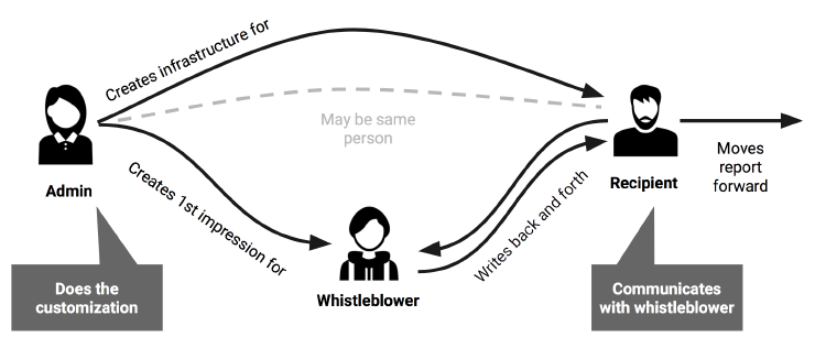
There are three roles for any GlobaLeaks installation: the Whistleblower who sends submission anonymously, the Administrator who sets up and maintains a copy of the platform (called an installation), and the Recipient who reads and processes the submissions. Allowing for customization shouldn’t distract from the need to provide “out-of-the-box” default options that make sense, not only to the Whistleblower but also to the people working behind a GlobaLeaks installation.
To establish priority and clarity of customization options, we mapped out the relationship and points of contact among the main stakeholders of the platform. This allowed us to gain a deeper understanding of each role’s needs and identify their most-used features.

The relationship between the main stakeholders of a typical GlobaLeaks installation.
As we realized that customization is key to communication, we wanted the new information architecture to encourage the Recipient to customize actively but also provide a default that is sufficient for those who don’t adjust settings. When it became clear that only certain options are relevant for certain contexts, it was easier to organize options with a card sorting exercise. For example, as Recipient directly communicates with Whistleblower, they should have permission to customize the questionnaires (submission form) and the text on the whistleblower interface, not the network and other technical settings.
There are many open-source platforms that can be installed on various instances hosted by different organizations. Deciding on these defaults is perhaps the single most important task for any team working on highly customizable platforms.
Accessibility and Localization
There is no single design solution that will work for everyone. The global nature of GlobaLeaks means that it needs to be culturally and linguistically agnostic and customizable to a variety of contexts. Thorough research into the cultural, political, and social context of the target region reveals significant insights that help strengthen a design and enable it to serve better in a high-risk environment.
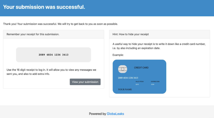
In the case of GlobaLeaks, the credit card image shown after the submission was perceived differently depending on the whistleblower’s cultural background and knowledge. For example, during our user interviews, we found out whistleblowers from Vietnam weren’t confused by the credit card while whistleblowers from the USA believed that payment was required.
To avoid miscommunication and misunderstanding, we recommend that organizations be considerate about their aesthetic choices and work closely with a native speaker of the language of installation or those who are familiar with the Whistleblowers’ process.

Screenshot of the credit card image on the demo platform.
Branding and Trust: How might we create a trustworthy experience for whistleblowers?
GlobaLeaks faces a branding challenge: they provide the open-source platform but do not control the individual installations. Questions like “What is GlobaLeaks?” vs “What is the New York Times whistleblowing platform?” will arise for people who are curious about the platform. GlobaLeaks shouldn’t assume that people who are willing to trust the New York Times, will also trust a platform chosen by the New York Times to host whistleblower submissions.
Organizations which use GlobaLeaks must develop an understanding of their whistleblower users and with that, establish a trust to increase engagement. Allowing for customization of CSS styles is only one part of the equation; it is equally important to help organizations adjust the language and manage cultural expectations.
As an open-source submission framework, Globaleaks already provides source code that is more transparent and secure than closed-source technology. Open-source technology in itself is trustworthy, but potential whistleblowers need to be certain they know who they are sending a report to, and what is likely to happen afterwards. The whistleblower is unlikely to be familiar with GlobaLeaks and Hermes Center for Transparency and Digital Human Rights (the organization behind GlobaLeaks) so relying on GlobaLeaks/Hermes brand credibility alone isn’t sufficient.
The appearance of a design should match the user’s emotional state. Yet, a professional look doesn’t always mean that it is trustworthy. Therefore, efficient communication and transparency are key for better user experience.
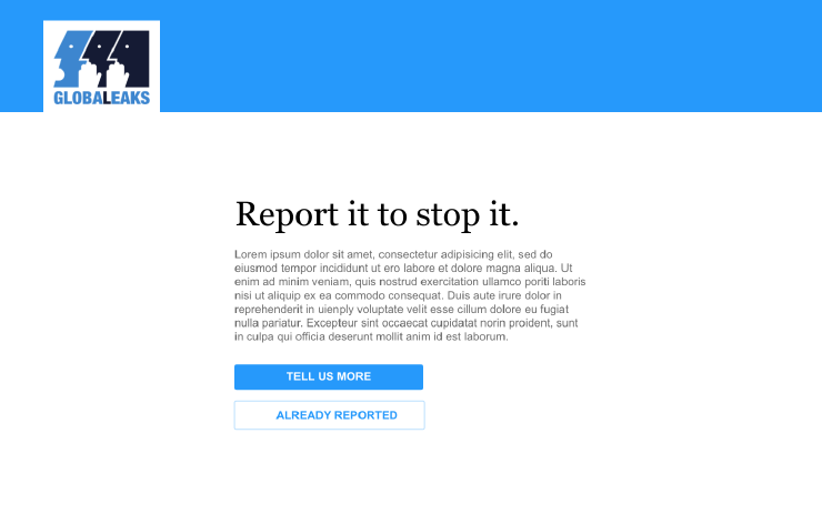
We leveraged concise language and clean visuals to communicate trustworthiness and increase the transparency of the submission process. We wanted the mock-ups for the Whistleblower interface to be simple, clean, and easy to navigate. Additionally, we chose language that is friendly, easy to understand and be customizable to various geographical and cultural contexts.

A whistleblower landing page mockup experimenting with a different tone of language.
In most open-source designs, the option to customize is often extensive. Customization should be easy while taking into consideration the power of defaults—especially in a highly sensitive platform like GlobaLeaks where trust and security are intertwined.
With these three key takeaways, we hope to highlight the importance of research and the versatility of open-source design in projects that seek to serve a larger community.
This project was funded through OTF’s Usability Lab.