We spoke with sajolida from Tails about design methods, user research, and particular challenges in open source.
Before we begin, could you tell us what Tails is and what it’s used for?
Tails is a live operating system that you can start on any computer from a USB stick. It provides a secure computing environment out of the box.
Activists and journalists use Tails to create dissident books and videos, chat off-the-record, browse the web anonymously, and share sensitive documents. It is free software and is used by more than 20,000 people daily.
What is it that you do for Tails?
Even though I have a background in computer science, I never really jumped into writing core but do a lot of the work needed around the code itself. We are a small team and people are doing many different things. I started doing documentation and website. We always had a strong policy to have an extensive documentation. By necessity I’m also doing fundraising and accounting, and more recently I started doing UX, checking whether our interfaces actually work for people, etc.
How did your UX work come about in the first place?
In 2014, we got in touch with a startup incubator in Paris called NUMA. They wanted to contribute to open source projects and we organized some user testing sessions together. That was the start of our UX journey. For that event we prepared a list of tasks, e.g. “how to chat securely with your friends”, and they organised the space and recruiting. For us it was a big eye-opener, because people were not able to complete any of the tasks we posed to them! The problems were elsewhere and people had serious problem starting Tails and getting connected to the network.
Then we worked with them on mapping the installation process. The website was very badly organized back then and people were constantly getting lost. We sat down and tried to make the process more streamlined. While doing this, we also started incorporating early testing of our designs. For example, had people click through very rough prototypes created using interactive slide shows. We were two people, so we did parallel design and had people test different solutions. That was the beginning!
So you learned design methods along the way?
Across the process of designing the installation instructions, we worked with NUMA and then on our own. It really had opened our eyes, using just very simple methodologies. We continued learning more UX methods on our own, reading books and online resources, and listening to the advice of experienced UX designers every time we could.
Designers are notoriously hard to find in open source. How is UX in open source different from UX in the industry?
I think that UX is becoming more and more important in the software industry, because a lot of revenue is directly tied to UX. Oftentimes companies are competing with very similar services, and a better UX, even just by a little bit, might be the deciding factor. Of course, in open source we’re not fighting for market shares and money and I have the feeling that the importance of UX is neglected, because the survival of a project does not depend so strongly on your product being useful and usable. In the case of Internet freedom tools, it’s often external funding that determines your survival, not so much your success over the competition.
And of course success is hard to measure in open source to begin with!
Yes. We don’t ask people to subscribe, we don’t collect usage data, there’s no payment, etc. So it’s hard to have success metrics, especially if you want to respect the privacy of your users! One technique we experimented with was to do a survey from our website. If you ask respectfully, and if people understand how useful it is, people are ready to participate!
You recently had an UX/UI design sprint in Berlin, can you tell us more about it?
Actually we had two sprints of three days each this winter. We are working on two new features for Tails and wanted to check our designs with users right from the start. We were two people in each sprint: the main developer of the feature and me.
We arrived on the first day with our prior research on the feature, for example the results of a user survey or feasibility studies on the technical issues, but zero design. We started by doing a design studio the two of us to come up with a candidate design that we could draw and print on paper.

In the afternoon of the first day we had our first users come over and test our paper prototype. On the second and third day we continued inviting people to come and test our prototype as we improved our design. We had 7 users come over for each sprint, counting two hours per participants to have time to debrief and prepare the prototype for the next participant.
That’s for the initial sprint. After the feature is developed, we also do some moderated user testing with a beta version of the feature. But if I could only do one set of tests I would keep the early paper prototyping. Because if you only test at the end, you’ll find out too late that thing you’ve built is bad!
I can’t see myself building anything in the future without going through a process like this.
We at Simply Secure are big believers in paper prototypes. What role did they play in your testing?
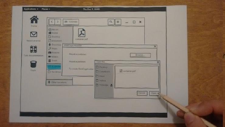
With paper prototypes, you draw or print your interface on paper. You create pieces of paper for each moving part of your interface: a menu that opens, a dialog box that appears, a checkbox that gets selected, etc. You give the user a pencil and pretend that it’s their mouse, to click, and keyboard, to write. The pieces of paper and the pencil are like a magic computer: they can click anywhere, write anything, and you are playing the computer, changing and moving the pieces of paper as the person uses the interface. It’s surprising how fast people get it.
Something that’s tricky for us: since Tails is a full operating system, most of the time we’re not building the tools ourselves. We are relying on Debian, on GNOME, and on all sorts of preexisting tools. In the two sprints we did, it was mostly integration work. Paper prototypes were especially useful in this case, since we could print out mockups of existing GNOME interfaces and several other tools and test the changes that we wanted to make to them.
All-in-all, the new things that we designed represented maybe 10% of the overall experience. Doing even a rough code prototype for all this would have been impossible. You would have to change things all over the place!
How useful were these sessions for you and your team?
We involved our developers in this process. I was mainly facilitating the feedback, preparing the prototypes etc. And the developers were just observing. That was super useful, mostly for four reasons:
- Often when you tell developers that what they’re designing is going to be too complicated, they don’t believe you. But when they see one person being confused, they go back and really want to fix the problem.
- You also make sure that what you are designing is possible for them to implement. Sometimes they also come up with solutions that you wouldn’t have considered yourself because they know better the technical implications.
- If you disagree on a design choice, you avoid endless debates by testing any of the proposed solutions with the next user and learning from that. You can even show two different versions to the same user, have them comment on both, and learn even more.
- We are a remote team and being in an office working on the same sheet of paper is so much better. Once the sprint is over, you don’t have to explain your design because the developers saw it in action. The drawings from the sprint are the only specification that they need to write the code.
It wasn’t hard to find participants?
Not at all! The interest we found in Berlin was overwhelming. People wanted to help. It was so easy to recruit people. We had 100 and 175 people, respectively, answer our call on our website for both our sprints. This is really amazing!
What were some of your findings? How has that informed your design?
It’s fascinating how often the problems that you identify with user testing are really not were you expected them to be…
Our first sprint was about integrating VeraCrypt in GNOME, the desktop environment in Tails. Instead of having a dedicated application to unlock VeraCrypt volumes, for example an encrypted USB stick, we integrated that in the native GNOME environment like you would do to open a regular USB stick. But this made the whole thing too transparent for people who were otherwise used to have a dedicated VeraCrypt application in Windows for example.
We solved that by adding a little wrapper in our applications menu that has the word “VeraCrypt” in it. It provides shortcuts to the most common operations and a link to our documentation. It will teach people how to do it seamlessly the next time.
You’re not testing to see if it works; you’re testing to evolve and change as much as you want and as best as you can.
Do you observe or record your tests?
I don’t record. We are changing the prototype between each test. It’s a formative process. For example, participants might misunderstand some interface widgets or labels that we designed. We would draw new widgets or change the labels on the fly until it works for them. You’re not testing to see if it works; you’re testing to evolve and change as much as you want and as best as you can. You also get ideas or suggestions directly from the participants.
What are you plans next?
Most of the UX things we’ve been doing are task-oriented. Something we’d like to do more in the project is storytelling and explaining what Tails is and why people should use it. This is more complicated for me, after all I am a scientist and I more used to solving problem. Finding a narrative is a challenge! Communication, branding, design—maybe that’s a next gap to fill.
Thank you, sajolida!
