
- YouTube will now hide the downvote count on videos to mitigate harassment — but it’s still unclear what choices users have to control the content they are recommended.
- In collaboration with Mozilla’s YouTube Regrets project, Simply Secure mapped and analyzed YouTube’s controls from a usability standpoint to understand if the design supported user experience principles of control, freedom, and transparency.
- Many opportunities for user control are actually masked dark patterns. We must recognize that a lot of the designs users interact with are coming from business interest, and not from the perspective of user care.
Today’s conversation about YouTube is largely centered on engagement. YouTube is one of the original user-generated content platforms that has become everyday infrastructure for web-based video. Platforms that enable users to post and share content present as democratic spaces, enabling users to converse, engage, and see how others react to content, but the design of the platforms themselves impact how these exchanges happen. There’s an assumption that when videos are up-voted, they are shared more widely, and when content is downvoted it’s hidden from public view. In reality, YouTube counts all engagement equally — since their business model is driven by user engagement, the type of engagement doesn’t matter. (To combat the weaponization of the downvote button, YouTube has now hidden the downvote count, although the functionality remains.)
When companies make their money through engagement or time spent on their platforms, they are incentivized to employ deceiving design patterns, usually referred to as Dark Patterns, or at the very least, not invest in usable controls.
It’s not always clear how recommendation engines on sites like YouTube and Instagram choose the content that gets promoted. It’s even less clear if users can do anything to control which types of content are recommended. As reported in Mozilla’s YouTube Regrets project, the platform makes it difficult for users to maintain control over content recommendations. In reading over thirty thousand stories from users, Mozilla found that it was unclear if YouTube even acted on their requests to remove undesirable or offensive content.
This begs the question — what control do YouTube users have? What is the user experience of YouTube’s controls for feedback on content? In collaboration with Mozilla’s YouTube Regrets project, we took a deep dive into YouTube’s user controls to analyze how they support user choice — the result was a disappointing but unsurprising maze of loops, deadends, and never-ending paths.
A Bridge to Nowhere: Mapping YouTube Controls (2020)
To understand the recommendation algorithm controls, we created a new YouTube account and mapped the possible paths and options that a user could take to customize their experience. We found that:
- “Settings” don’t actually mean anything — there’s nothing you can control on the Settings page.
- Existing controls are reactive and not proactive, leaving users to catch-up to the recommendation engine rather than designing what they want to see.
- There are multiple ways to get to some pages. This can be helpful if the user doesn’t follow the happy path, but excessive use leads to confusion and frustration.
- Options to “teach” the algorithm are few and limited in scope.
- The words describing the outcome of each step are opaque. Various words are used to mean the same thing, and it’s unclear what comes next.
False Settings
YouTube Settings claims to allow users to choose what they see on YouTube however, there are actually no such controls on any of the settings sections.
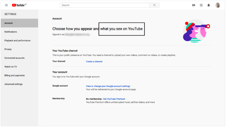
^ Settings: there aren’t actually controls for “what you see on YouTube”
Reactive Controls
The controls on YouTube Home follow a linear path. Since the controls are next to a video or topic, the law of proximity helps the user understand that they apply to a video, section or channel and find them easily — this shows us the controls are meant to be seen and used. However, a user would already need to get recommended these videos in order to make adjustments, so these controls are reactive, not proactive. This means users cannot discover and design their experience, but rather must shape it depending on what YouTube shows them.
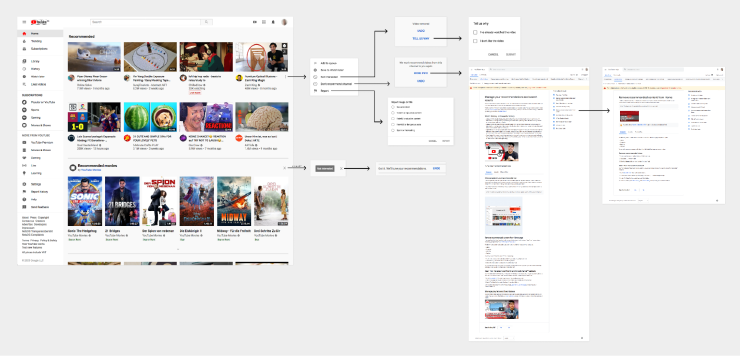
^ Mapping the path of user control on the YouTube ‘Home’.
When the user wants to teach the algorithm that they are no longer interested in the video, there is the option to click on “not interested.” This is separate from ‘reporting’ harmful or offensive content.

However, there are few options to explain why they wish to remove that content, which makes it difficult to properly teach the algorithm what further content a user may not want to see.
When the user selects that they are ‘not interested’ in a video, Youtube will remove the video and give the user the option to ‘undo’ or ‘tell us why.’ When the user selects ‘tell us why,’ they get this box:
![Home > Not interested [in a video] > Tell us why](/images/dark-patterns-in-user-controls-5_hu900272110509145500.png)
^ Home > Not interested [in a video] > Tell us why
Once the user makes their choice, the response is that YouTube will “tune” their recommendations. The language is unclear and doesn’t explain the outcome — what does it mean to “tune” recommendations?
![Home > Not interested [in a topic]](/images/dark-patterns-in-user-controls-6_hu11931862499371145145.png)
^ Home > Not interested [in a topic]
Other confirmation messages are clear and offer more information, which shows YouTube can provide clarity when they want to. This box appears when the user selects ‘Don’t recommend channel’:
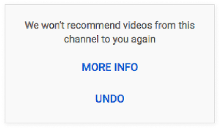
^ Home > Don’t recommend channel
In the few places like these, where a user can express their opinion about a YouTube video, the language is unclear and the expected outcomes are unknown. Do these choices make a difference? What is the algorithm really learning? Can the user trust that they won’t see content similar to what they’ve stated they don’t want to see? It creates a confusing experience, and begs the question, are some of these designs intentionally deceptive?
A Labyrinth of Buttons
An alternative path that a user might try is to review their Watch History or Search History — but when accessing the controls through these views, the paths become more convoluted. There are many pop-ups, each containing several links, and users must traverse multiple pages to find any guidance and documentation. Many of these pages are circular, leading us back to a page we’ve seen before, but not providing additional transparency or clarity to the user.
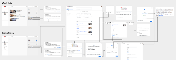
^ Mapping YouTube Watch History and Search History controls
Many pages and pop-ups contain the same content with few differences:

^ Pop-ups with similar content appear in different places
Users follow a loop, without actually changing any settings. In this circular path, there are two pages with the name “YouTube History”.
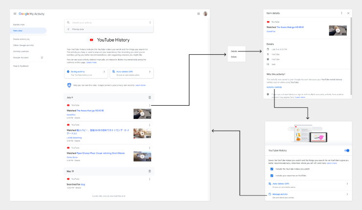
^ Going in circles with YouTube History
The controls for Watch History and Search History both contain links for “My Activity,” yet these links direct users to different pages.
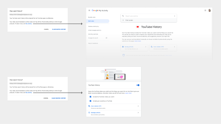
^ “My Activity” link goes to different pages
On the page for YouTube History, there are many paths to arrive at the same pop-up, and some links use different wording.
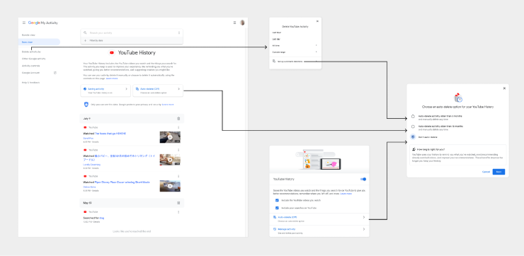
^ Many ways to get to “auto-delete option”
The more steps and loops that users are asked to go through, the less likely that they will ever actually reach the final page. This labyrinth of buttons makes it clear that YouTube does not prioritize allowing users to control their experience through the Watch History and Search History, and appears to be designing these flows to dissuade users from these controls overall.
Designing for User Agency: A Balance with Policy
It’s unclear how often these controls are used, but we know that at least 37,380 users tried. So while YouTube’s mission might be to “give everyone a voice,” they are systematically excluding their users from having a voice in what they want to see.
Dark patterns are designs that give people the perception of choice, while actually prioritizing and coercing users into the business goals of the tools they’re using. Because the business model is to drive engagement at any cost, we know that these choices are intentional design choices — a business decision to ignore user agency and transparency, even when it comes to harmful and offensive content. Here we’ve focused on the individual experience, but these controls are even more challenging for parents attempting to protect their children. These tactics show the power imbalance between YouTube and their users — but don’t forget that like all user-generated content platforms, without users, YouTube has nothing.
The consequences of a lack of control — and poorly designed controls — are that harmful content goes unchecked and users have bad experiences while feeling a false sense of security and trust. Interventions into the industry’s use of dark patterns is at the heart of many policy conversations today, from GDPR in the EU and CCPA in California to the UK’s Online Harms bill and India’s Intermediary Guidelines and Digital Media Ethics Code. In addition to regulations and policies that are currently in discussion, companies can improve this situation by prioritizing increasing user agency and transparency in these interfaces. As the people using these platforms, we can demand these changes.
Giving users control, freedom and transparency of how algorithms work may be in conflict with the business model for many platforms, like YouTube — though it doesn’t have to be. If platforms made it easier for users to find and “tune” recommendations, we would likely watch and engage more.
Credits
Project Contributors: Kelsey Smith, Georgia Bullen, Ame Elliott.
With support from Reset, in collaboration with the Mozilla Advocacy team.