Researchers who want to evaluate software interfaces have a number of tools at their disposal. One option for identifying obvious and significant problems is an expert review, which is often used to catch low-hanging fruit before performing any kind of user testing. Expert reviews employ usability heuristics, which systematically explore potential problems with a piece of software by applying patterns for good design.
With some guidance from UX-research veteran Susan Farrell, we recently performed expert reviews of a few open source tools for encrypting communications. Each expert review included evaluation by myself and at least one additional researcher; many thanks to Arne Renkema-Padmos, Robert Stribley, and Bernard Tyers for their work on this project. During the review we described issues and took screenshots to illustrate them. After prioritizing the issues by severity and picking our top 15, we compared our findings with one another and synthesized them into a single report.
One of the tools we reviewed was Briar, an open source peer-to-peer communications application for Android. Briar uses a range of communications methods — Bluetooth, Wi-Fi, or Tor — to provide users end-to-end encryption for messaging.
We picked Briar to review because the development team expressed readiness (and eagerness!) to get and incorporate feedback. You can access our full report here. Below are a few insights regarding visibility, an important element of successful user interfaces.
Visibility
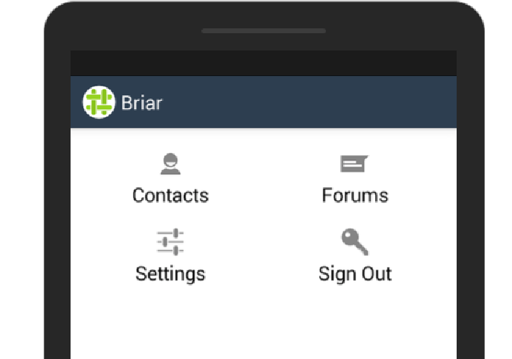
An overarching issue that Briar has, which it shares with a number of applications in the FLOSS secure tools space, is a lack of visibility into system and messaging status. Researchers found it unclear how Briar was connecting to the network at a particular moment in time – was it via Bluetooth, Wi-Fi, or Tor? – making it hard to troubleshoot when a connection was not working. Status icons do not make it clear when Briar is running versus when Briar is actually connected.
Additionally, Briar does not yet do a thorough job of indicating when a message has been delivered. Because Briar can only deliver messages when a user is online, it can be hard to tell whether a message has made it through to the recipient. Briar also does not display an icon on its main screen to indicate when new messages have arrived.
 Briar’s main screen currently does not provide a flag to make visible when new messages have arrived, requiring the user to dig into ‘Contacts’ or ‘Forums’ to discover them.
Visibility is a crucial principle of usable design. Users need indications that they are correctly understanding the status of the system, that it has changed, or that they need to take action. While we were successful at using Briar to get a message to friends in the same room (the case which we tested), a clearer picture of where messages were in transit would have helped us better understand when and why we were having trouble.
See the full report on our review of Briar here.