Guiding Mailvelope users through the headaches of key management

- The Mailvelope browser extension helps people add an extra layer of security to their email communications by making PGP encryption accessible and usable.
- With support from the UXFund, Simply Secure designed and tested new ways that Mailvelope could help users if they received an email from a contact who used a new keypair.
- With these UX changes, Mailvelope continues to offer usable security measures to more people who need it.
This is the second blog post in a series about working with the Mailvelope team. Check out part 1.
If you’ve ever needed to send an email that nobody except the recipient can read, you’ve probably heard of PGP. And no matter how expert you are, you’ve probably gotten stuck once or twice managing keys.
For over 30 years, the PGP (Pretty Good Privacy) encryption method has allowed people to encrypt their emails so that intercepted messages can’t be read by adversaries, email providers, ISPs, or indeed any third party. To accomplish this, messages are encrypted into a code that only the recipient can unscramble, using a keypair mechanism that both encrypts and unlocks messages. All PGP users have their own keypair: 1) a public key to share with their contacts, and 2) a private key to keep secret. (To learn more about how public-key cryptography works, check out this explainer from the Electronic Frontier Foundation.)
Managing a contact list of public keys is like managing the contact list in your phone: people occasionally get new public keys, just like they may get new email or postal addresses. Their public key is probably uploaded to a server called a keyserver, but can expire or be manually revoked. And in order to send a secure email to a person, you need to know a public key that you are certain belongs to them. That’s where Mailvelope comes in.
Mailvelope is a browser extension that integrates key management with your webmail interface. This means you can select keys from an address book, or “keyring,” and send an encrypted email in just a few clicks. But what about these tricky cases when people change their keys, or even have multiple keys? How can you be sure you’re messaging the right person? With the support of UXFund, Mailvelope came to Simply Secure to collaborate on a solution.
Key management’s two big headaches
How could we make key management less confusing using clearer UX design? We approached the two most confusing key management scenarios by setting up some lightweight user feedback sessions.
Scenario A: What if you get an email from Maria, but it’s encrypted with a different key than before? Is this really Maria? Or is it an imposter?
This is like getting a letter from Maria with a New York postmark when you thought she lived in Los Angeles. It might be legitimate, but you might want to check with her and see if she moved.
Sometimes people revoke or abandon an old keypair (public + private keys) and generate a new one. Although generating a new keypair may be necessary if the old one was compromised, a new keypair may also mean that somebody is impersonating your contact and intercepting messages (called a “Monster-In-The-Middle” attack). We wanted to find a way to help Mailvelope’s users if they received an email from a contact who used a new keypair.
We focused on a notification that would alert the Mailvelope user about a sender’s keypair change. Our goal was to support the user as much as possible and not ask them to make any decisions they didn’t understand. To offer guidance in this unfamiliar, and potentially risky, situation, we knew that careful, concise interface guidance was crucial. For comparison, we found examples from other messaging software, like WhatsApp. Its notification message reads, “Your security code with [person] changed. Tap to learn more”.
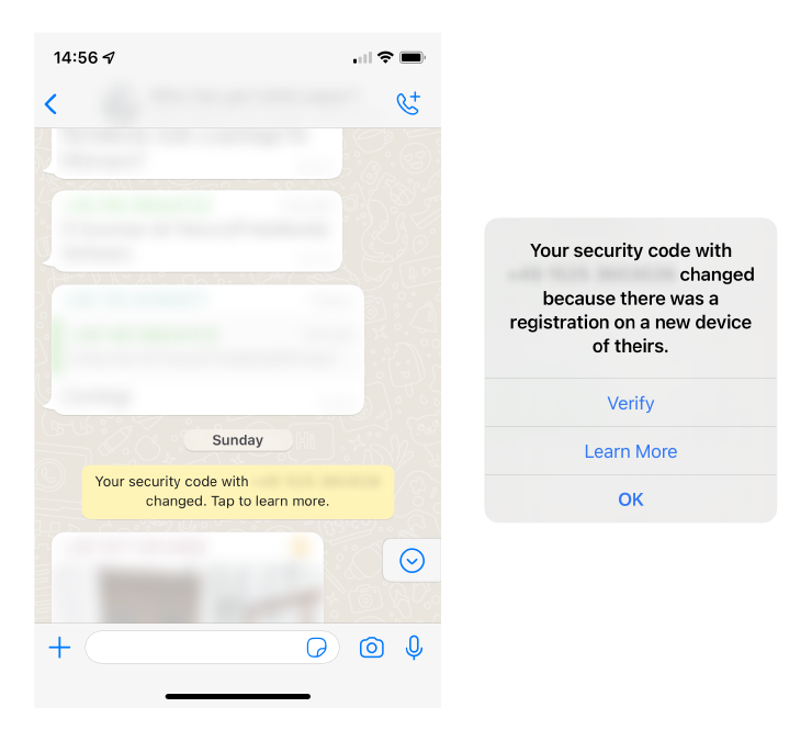
When a person gets a new phone, their contacts will see the message: “Your security code with X has changed.” Tap to learn more displays the message: “Your security code with X changed because there was a registration on a new device of theirs.”
We decided on a modal design that displayed what happened, the new key details, potential constraints, and advice for what to do next
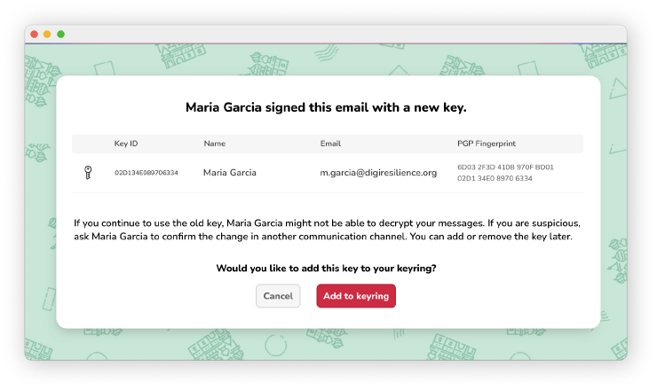
We decided on a modal design that displayed what happened, the new key details, potential constraints, and advice for what to do next.
How testing helped us solidify our design
When we asked people what they would do when faced with this design, we learned that our pop-up message helped users immediately understand the situation: “Maria probably changed her key.” Yet, participants were cautious (PGP users tend to be security-minded!): “Before accepting the key, I would get an OK from Maria on Signal.” The message we added is clearly necessary: as one user said, “The warning makes me feel more comfortable that I’m doing the right thing.” In our testing, some people chose Add to Keyring for the new keypair, while others preferred to stay on the safe side with Cancel. Offering both options allowed them to select the choice that best matched their level of risk.
While user testing confirmed some design choices, it also prompted some changes. We realized that the process needed a confirmation message for adding a key. One participant said, “I think I need to go to another page where I save the key.” A participant said, “I feel pressured to add it to my keyring, because the alternative is that it disappears forever.” So we proposed to change the copy from Cancel to Not now.


We proposed some changes to the design such as a confirmation message and changing the secondary button to “not now”.
Testing our prototype proved incredibly useful because we learned which designs achieved our goal.
Scenario B: What if you want to send an email to Maria, but you have many different keys for Maria?
While changing out keypairs is a useful security tactic, a side effect is that other people still have all those old keys. It’s as though Maria has moved a lot recently and you might not be sure where you can send her a letter.
To help Mailvelope users choose their recipients’ current key quickly and easily, we focused on the compose email window, specifically the autocomplete dropdown for the recipient’s email. We considered various well-known symbols (like a checkmark and flag) or adding a tag (like “default key” “primary key” or “Mailvelope’s pick”) that could identify the key, but a lot of these ideas already had another meaning in the PGP world. Any new icons that we made up created more questions than answers. In short, this was a complicated message to boil down to one symbol. And unfortunately, highlighting and bolding interfered with the search list functionality.
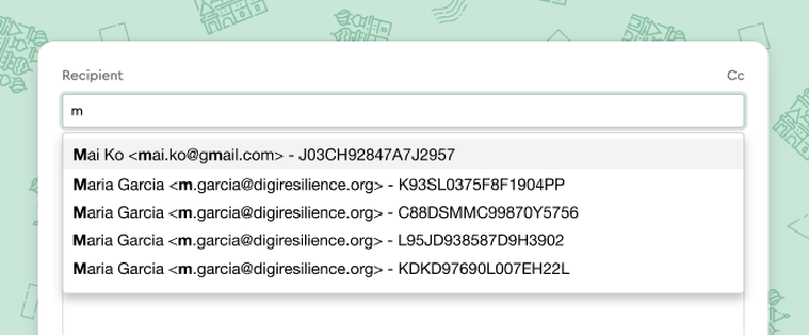
In the Mailvelope email compose window, a user starts typing in the email recipient and sees four possible key options for Maria.
We landed on putting the current key first in the list and indenting the old keys. We thought this design would guide users to the right choice but still give them options. The next step was testing it with users - would they understand what the indented list meant?
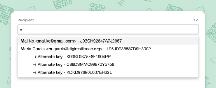
We converged on a dropdown list design that places the current key first and indents the other keys.
Good design can be invisible
When people typed in Maria’s email and saw four keys for Maria, they were puzzled. One participant said, “This seems wrong. Maria has many keys, somehow I imported all of them, and none are revoked.” This indented list was causing confusion, provoking questions but not giving enough answers. Either we needed to add more information or take away irrelevant information.
Our “a-ha” moment came when we realized that users don’t actually need to access old keys when they send messages (although old keys are still useful for decrypting old messages). So we scrapped all our “alternate key” designs and made the simplest version - just one public key is shown for Maria, because that’s all the sender needs to see. Our final design intervention is not even visible in the UI.
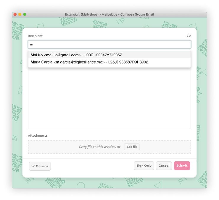
Our final design intervention is not even visible in the UI. Instead of displaying all the keys, we just show the right one for Maria. We show the user only what they need to see.
👉 Do you want to try this kind of user testing? We believe in the power of user testing so much that we put together a microsite with concise guides and examples to get you started.
Onward
For over 10 years, Mailvelope has helped people add a protective layer to their email communications. Mailvelope users are people who need a high level of security and can’t always use other secure communication tools, like Signal. They may not have a comprehensive understanding of how keypairs work – but they shouldn’t have to. With these small UX changes, Mailvelope continues its slow and steady journey towards offering usable security measures to more people who need it.
Credits
Project Contributors:
Kelsey Smith, UX Designer at Simply Secure
Thomas Oberndörfer, developer and founder of Mailvelope
Hero image of keys: by Alp Duran, Unsplash
With support from UXFund